LLM Agents in Software: Code vs Domain
Software companies build "SaaS"-like apps today. Agents will replace apps. Instead of UI, workflows, and app logic, they'll engineer prompts, APIs, and evals.
But apps needs domain and code.
LLMs are crushing the coding workload. This lowers cost of development, increasing ROI (so there'll hopefully be more demand).
In that coes, does domain matter more? It might seem so. But most actually people use LLMs more as a domain expert than a coder.
I think LLMs will eat domain work too in software. Sure, we need domain expertise. But domain agents can fill that gap (maybe leading to even more demand).
LLM Coding
These prompts were created using Claude Sonnet 4 on Claude.ai
Create a concise, visually engaging animated data story suitable for a small canvas (e.g. social media post or LinkedIn panel), ultimately to be rendered as a single animated GIF. The visual style should be clear, with bold labeling and distinct colors, ensuring readability on a compact screen. Follow these storyboard steps:
- Scene 1: Show a stacked vertical bar chart with two segments:
- Bottom segment: labeled "code"
- Top segment: labeled "domain"
- Use distinct colors.
- Append the message: "Apps need code and domain."
- Scene 2: Smoothly shrink the height of the code bar to indicate reduced effort. Append the message: "Coding agents reduce effort."
- Scene 3: Increase the width of both bars, implying more applications or demand. Append the message: "Lower cost increases demand."
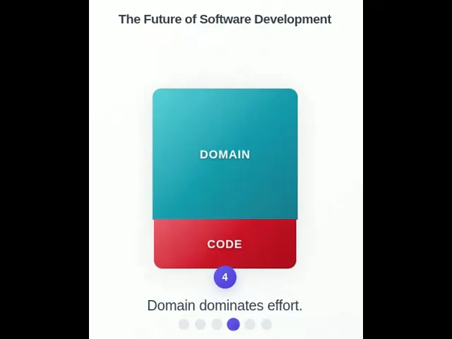
- Scene 4: Highlight that the domain bar now dominates the stack. Append the message: "Domain dominates effort."
- Scene 5: Shrink the domain bar to match the size of the code bar. Append the message: "Domain agents reduce effort."
- Scene 6: Again, increase the width of both bars. Append the message: "Lower cost drives demand."
- Ensure the animation transitions are smooth and intuitive. The final output should loop cleanly if possible and deliver a coherent story even as a standalone animated GIF.
I added a few suggestions:
A few suggestions.
- Pause at the end.
- Number the messages.
- Make the bars widen more and finally fill the bulk of the width of the canvas.
- Remove the blue bar to the left or the messages.
Make this more beautiful - Into an award winning data visualization, while retaining it's minimal philosophy
At this point, I had trouble. I tried this variation:
Make the little indicators at the bottom clickable. Allow swiping left and right. Make code and domain of equal height at the beginning and end. Show percentages alongside code and domain. Make sure these percentages are a multiple of 10%.
... and this:
Make the little indicators at the bottom clickable. Allow swiping left and right. No need to add instructions on how to swipe. Show percentages in a smaller font below the text code and domain. Make sure these percentages are a multiple of 10%. Shorten the code without losing functionality.
... but the percentages were not rendered at a position I was happy with and couldn't fix it with a few prompts.
Besides, I decided that the percentages were arbitrary and settled on:
Make the little indicators at the bottom clickable. Allow swiping left and right. No need to add instructions on how to swipe.
Drop the "Pausing..." indicator. Pause for longer at the end.
Increase the initial height of the bars initially so that it's much closer to the title.
Shorten the code without losing functionality.