Three Judges,
Thirty Filters

An AI generated 30 image filters. Three other AIs judged them. They could not have disagreed more — and what they disagreed about reveals everything.

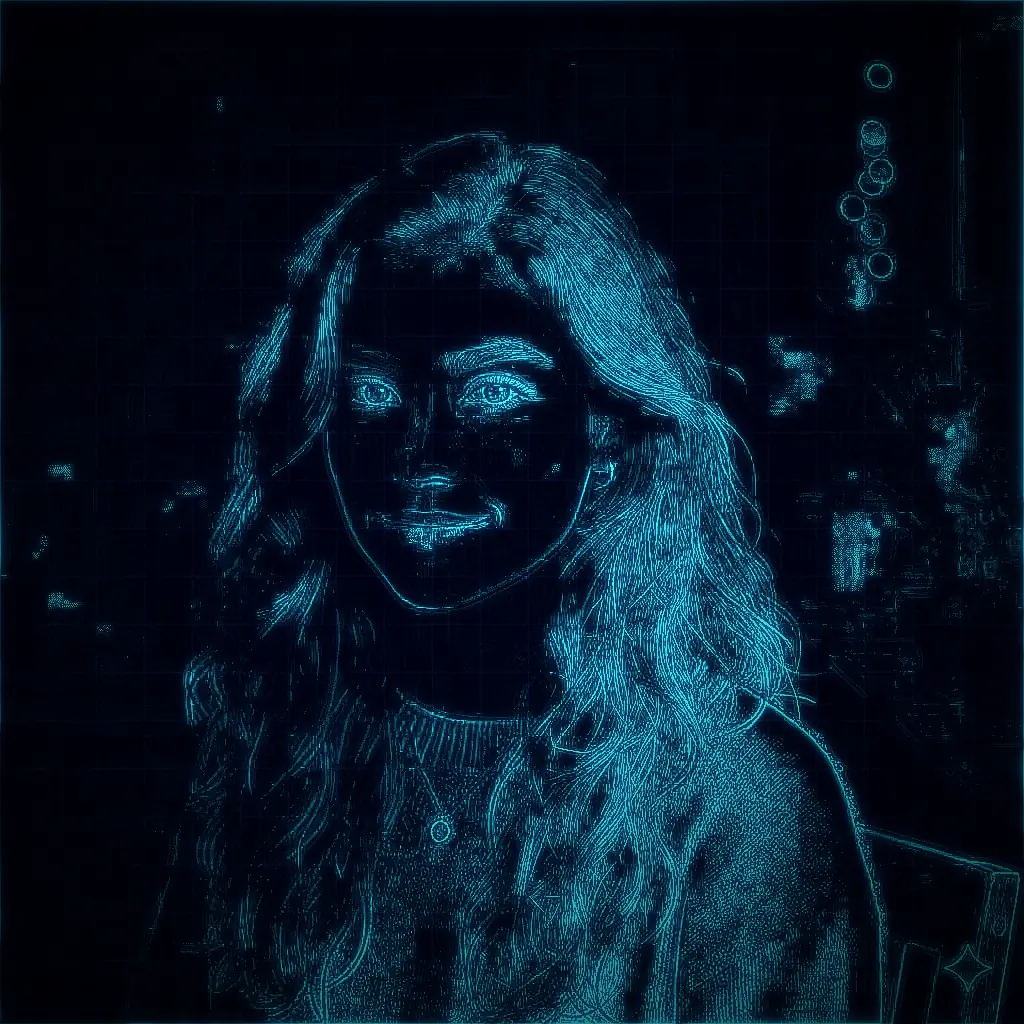
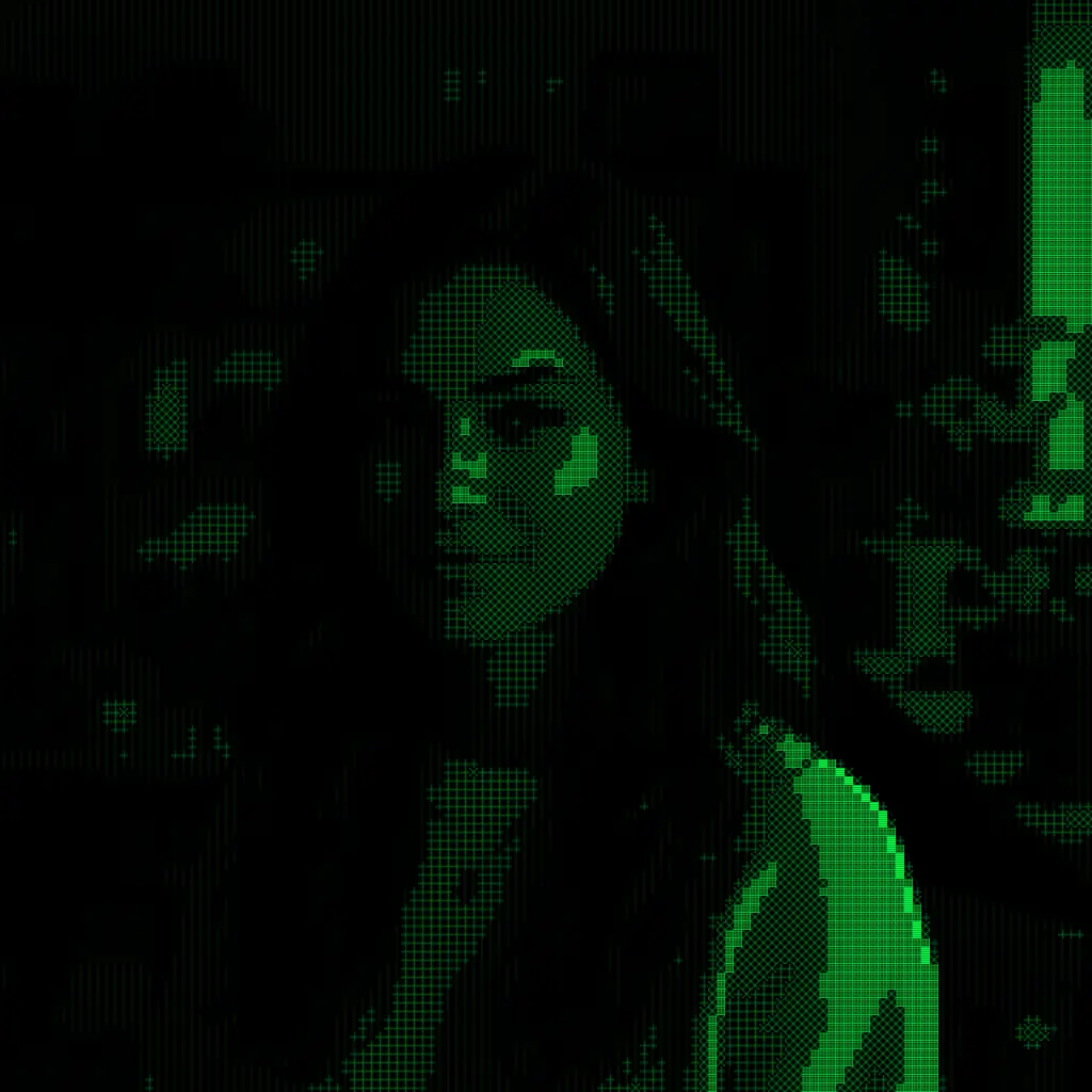
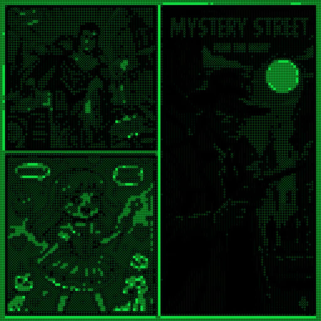
Imagine you are the third judge at an art exhibition. The first two judges have already voted. You pick up the first dossier — a filter called Terminal Matrix, which renders any photograph as glowing green phosphor characters on a jet-black screen, like a vintage computer terminal.

Judge One — methodical, holistic — awarded it 79 out of 100. Judge Two — a strict statistician who measured actual pixel data — gave it a perfect score: 10 out of 10. The highest mark awarded to anything in the entire exhibition.

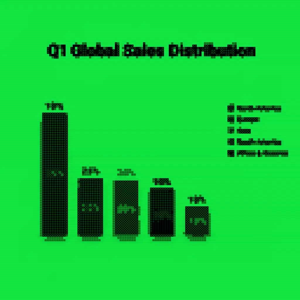
You study the output images carefully. You appreciate the atmospheric CRT glow, the phosphor-green portrait. But you also notice something the others missed: when this filter is applied to a bright sales chart, the light background turns the whole image into a sickly greenish wash instead of the crisp dark screen the concept demands. The filter has a blind spot. It only works in the dark.

You write: 6.6 out of 10. Rank: 22nd of 30.

7.9RANK #1
GPT
Holistic Judge
10RANK #1
Gemini
Pixel Analyst
6.6RANK #22
Claude
Medium Critic
Terminal Matrix — Portrait: Green phosphor glow on dark background — effective CRT effect
Portrait: Green phosphor glow — effective
Terminal Matrix — Comic: Noir panels rendered in phosphor green — convincing darkness
Comic: Noir panels — convincing darkness
Terminal Matrix — Chart: Light background breaks the CRT illusion, washing out to pale green
Chart: Light background breaks the CRT illusion

That gap — from a perfect score to the bottom third — is not a grading error. It is the entire story. Three artificial intelligences looked at the same thirty pieces of AI-generated art and came to dramatically different conclusions. Understanding why tells us something fundamental about how machine intelligence defines quality, and what it means to judge something good.

Act I

The Factory and Its Products

The story begins in early 2026, with a question about creative discovery. Could an AI not just follow instructions, but genuinely explore — proposing new aesthetic ideas, executing them, evaluating the results, iterating? The ambition was to demonstrate that LLMs could function as autonomous creative agents.

Claude Code (Sonnet 4.6) was given a simple but precise brief:

🎨
The Generation Prompt "Act as a world-class Aesthetic Architect. Generate 3 brand-new, sophisticated, and aesthetically distinct Signature Filters... Combinatorial Creativity: Prefer multi-step filters. A filter is a recipe. Distinct Moods: The 3 filters must look completely different from each other. Tech Stack: You can use ImageMagick, GMIC, Python (NumPy/PIL/OpenCV), or any other available tools."

The model ran. And ran. Over multiple sessions, it generated 30 distinct image filters — each with an evocative name, a README explaining the concept, and a shell script containing the actual code. Each was applied to three standard input images:

Input photograph: a portrait with continuous tone and organic form
Portrait photograph — organic, tonal
Input comic panel: structured, inked, with flat color areas and text
Comic panel — structured, inked
Input bar chart: Q1 Global Sales Distribution — precise geometry and small text
Bar chart — informational, typographic

Three inputs chosen because they are different: a photograph with continuous tone; a comic panel with inked outlines; a data chart with precise geometry and small text. A filter that works on all three is truly robust. One that only works in the dark has revealed its own limits.

Now came the question: how do you evaluate AI-generated art? Three language models were each given the same task — think like a world-class artist and critic, score rigorously — and each drew from a completely different well.

Act II

Three Very Different Judges Take the Stand

The evaluation prompts are documented in 📄 prompts.md and the full results in 📄 gpt-evaluation.md, 📄 sonnet-evaluation.md, and 📄 gemini-evaluation.md. Each judge received the same framing but applied it through a completely different lens.

GPT
GPT-5.3 Codex (xhigh) · 📄 source

"The Balanced Critic" — evaluated holistically across seven criteria. Concerned most with visual impact and concept coherence. The most conservative scorer: all 30 filters landed between 62 and 79 points. No dramatic outliers. The careful, fair judge.

  • Concept coherence15%
  • Visual impact20%
  • Color & tonal mastery15%
  • Structure legibility15%
  • Texture / material quality10%
  • Cross-input robustness15%
  • Artifact control10%
Claude Sonnet
claude-sonnet-4-5 · 📄 source

"The Medium Critic" — evaluated through art-historical specificity. The defining question: does this filter actually simulate the claimed technique, or does it just look vaguely like it? The widest score range (0.40–0.90). Willing to be severe. Deeply rewarded conceptual depth.

  • Aesthetic Authenticity25%
  • Conceptual Coherence20%
  • Cross-Input Versatility20%
  • Technical Execution20%
  • Artistic Impact15%
Gemini
Gemini 3 Pro · 📄 source

"The Pixel Analyst" — evaluated by measuring actual output pixels. Average color, unique color count, standard deviation. The most extreme scorer (0.30–1.00). Its defining question: do the pixel statistics match the stated aesthetic? If a filter claims "phosphor green CRT," is the average pixel actually green?

  • Avg color matches concept?key signal
  • Unique color count (palette?)key signal
  • Color std dev (contrast?)key signal
  • Single Overall score100%

GPT asked: Is it visually impressive? Claude asked: Is it true to its medium? Gemini asked: Do the numbers check out? These are not the same question — and the answers diverged accordingly.

Act III

The Map of Disagreement

Every point is one filter. Position shows Claude vs. GPT scores. Color shows Gemini's verdict. Click any point to open the full evaluation.

Claude vs. GPT Scores — Colored by Gemini
Hover to preview scores · Click to open full filter evaluation with output images
Gemini low (≤0.4)
Gemini mid (0.4–0.7)
Gemini high (≥0.7)

The first thing you notice is how vertical GPT's distribution is. Every filter scores between 0.62 and 0.79 — a band so narrow it almost looks like a technical artifact. GPT was the centrist judge. It found merit in everything.

Claude's distribution tells the opposite story: a full half-point spread from 0.40 to 0.90. Look for the bright green dot in the upper-left — Terminal Matrix. GPT thought it was good. Gemini thought it was perfect. Claude thought it was struggling. And the red dot in the upper-right — the filter both Claude and GPT ranked highly, which Gemini dismissed. That is Thermal Scan.

The Details

When the Judges Couldn't Agree

Terminal Matrix

Maximum Controversy
GPT: 7.9 · #1 Gemini: 10.0 · #1 Claude: 6.6 · #22

Renders images as ASCII characters on a phosphor-green CRT terminal.

Terminal Matrix — Portrait: face rendered in glowing green ASCII on black background
Portrait: Phosphor glow on dark — CRT illusion intact
Terminal Matrix — Chart: light background washes out to pale green, CRT effect fails
Chart: Light background destroys the CRT illusion

"Perfect Execution. This is a masterclass in constraint. By forcing the image into a specific, narrow color space — phosphor green — it creates a cohesive and instantly recognizable look."

— Gemini · Avg Color: [13, 201, 56] (Vivid Green) · 📄 source

"When the filter works — on dark inputs — it's exceptional. When it fails — on light inputs — the failure is complete. The chart has a light background; the filter renders it as a green-tinted wash."

— Claude Sonnet · Cross-Input Versatility: 5.0/10 · 📄 source

Thermal Scan

Expert vs. Analyst
GPT: 7.8 · #2 Claude: 9.0 · #1 Gemini: 4.0 · (bottom half)
Thermal Scan — Portrait: genuine FLIR camera effect with 8-stop LUT, face glowing hot-white
Portrait: Genuine FLIR camera effect — "one of the strongest outputs in the entire gallery"
Thermal Scan — Chart: bars heat-mapped by height, tallest bar glows hottest red-white
Chart: Bars heat-mapped by height — "conceptually richer than the original"

"The most technically accomplished and consistently excellent filter in the gallery. Authentic, coherent, versatile, and beautiful. A clear gold standard."

— Claude Sonnet · Overall: 9.0/10 · 📄 source

"The average color is grey. A thermal scan should be vibrant — Blue/Red/Yellow. This looks desaturated and incorrect."

— Gemini · Avg Color: [132, 122, 119] · 📄 source

Gemini averaged across all three outputs. The chart and comic (darker inputs) pull the average into grey territory. Claude was looking at the portrait in isolation and seeing a masterpiece. Both are right. They measured different things.

CMYK Separation

Process vs. Appearance
GPT: 7.2 · #21 Claude: 8.6 · #3 Gemini: 3.0 · (lowest tier)
CMYK Separation — Comic: halftone dots at C:15° M:75° Y:0° K:45°, misregistration creates authentic print fringing
Comic: Halftone dots at correct screen angles — C:15° M:75° Y:0° K:45°
CMYK Separation — Portrait: dot density varies with tone, color fringing at edges matches offset lithography
Portrait: Misregistration matches offset lithography imperfection

"This is a filter about how printing works, not just what printing looks like. The screen angles are technically correct — the single most impressive act of medium fidelity in the gallery."

— Claude Sonnet · Conceptual Coherence: 9.0/10 · 📄 source

"'Separation' implies seeing the dots/layers. The high color count suggests it's just a blurry photo."

— Gemini · Unique Colors: ~8000 · 📄 source

Eight thousand unique colors in the output means the pixels weren't quantized — no flat CMYK blocks. But this is precisely correct: real offset printing uses continuous halftone dots at sub-pixel scale; zoomed out, they blend optically, producing thousands of apparent hues. Gemini's color-count heuristic confused accuracy for failure.

Where They Agreed

The Unanimous Winner

One filter achieved something remarkable: it satisfied the holistic art critic, the medium fidelity perfectionist, and the pixel statistician simultaneously. Its name was Neon Blueprint.

Neon Blueprint

Consensus Excellence
GPT: 7.8 · #3 Claude: 8.8 · #2 Gemini: 9.0 · #1

Consensus mean: 8.53/10 — highest in the gallery.

Neon Blueprint — Portrait: edge detection reveals luminous cyan architectural drawing on deep navy
"Luminous architectural drawing, as if a master draughtsman traced the subject in light"
Neon Blueprint — Comic: MYSTERY STREET title glows like a neon sign against deep navy night sky
"MYSTERY STREET reads like a neon sign against night sky"
Neon Blueprint — Chart: cyan-glowing bar edges on navy behave like luminous engineering diagrams
"Cyan-glowing bar edges on navy — luminous engineering diagrams"

Why consensus? Its average pixel: [6, 23, 39] — deep navy, exactly what an architectural blueprint looks like. High pixel variance because glowing cyan edges create dramatic contrast against the dark background. Gemini's statistics confirmed it. Claude's art-historical knowledge praised it. GPT's holistic eye admired it.

The code behind it is elegantly simple — a recipe for light from darkness:

# Neon Blueprint — core logic (Python/NumPy) · filters/neon-blueprint.sh
# Step 1: Build a dark navy canvas
bg = np.zeros((h, w, 3), dtype=np.float32)
bg[:, :, 2] = 18   # faint blue base

# Step 2: Draw subtle grid (blueprint paper)
bg[::48, :, 1] += 8;  bg[::48, :, 2] += 22

# Step 3: Extract edges, add layered glow
edges   = sharp.filter(ImageFilter.FIND_EDGES)
glow_sm = edges.filter(ImageFilter.GaussianBlur(3))
glow_lg = edges.filter(ImageFilter.GaussianBlur(8))

# Layer: large glow (blue), medium glow (cyan), sharp edges (white-cyan)
bg[:, :, 1] += gl * 100;  bg[:, :, 2] += gl * 160  # large glow
bg[:, :, 1] += gs * 200;  bg[:, :, 2] += gs * 230  # cyan glow
bg[:, :, 1] += e  * 255;  bg[:, :, 2] += e  * 255  # sharp edges

The filter works because it commits to a fundamental premise: everything begins in darkness. Every feature of the input image is reborn as light — luminous edges, glowing grid lines, cyan contours. Pure contrast. That is why it works on photographs and comics and bar charts alike.

The second filter to approach consensus was Prussian Cyanotype — Gemini 9.0 ("A beautiful example of historical emulation"), GPT 7.5, Claude 8.1. Both top consensus filters are monochromatic systems: one color dominating a dark or pale field. Simple enough for the pixel statistician. Precise enough for the medium critic. Bold enough for the generalist judge.

The Full Picture

All Thirty Filters, All Three Judges

Sorted by consensus average. Click any row to open the full evaluation with output images.

GPT
Claude Sonnet
Gemini
0.17GPT score range
(most compressed)
0.50Claude score range
(most discriminating)
0.70Gemini score range
(most extreme)
8.53Neon Blueprint
consensus score
30Filters generated,
first attempt

The Dividing Lines

The Most Contested Filters

Ranked by gap between highest and lowest score. Click any row to open the full evaluation.

Score Range per Filter (max − min across all three evaluators)
A large range means the three "definitions of quality" diverge most sharply for that filter.

At the top: CMYK Separation (0.56 range), Thermal Scan (0.50 range), Infrared Reverie (0.46 range). All simulate real physical processes — and Gemini's pixel-statistics approach consistently misread them. Near the bottom: Neon Blueprint, where all three questions converged on the same answer.

Conclusions

What Three AIs Disagreeing Tells Us

There is a detective's principle that applies here: when witnesses to the same event give radically different accounts, the investigator should ask — what were they each positioned to see?

GPT was positioned as a holistic art judge. Its compressed scoring range (0.62–0.79) reflects genuine professional conservatism: an experienced judge doesn't give 90s to ordinary good work, and doesn't give 40s unless something has truly failed. Everything here was competent.

Claude was positioned as a medium-fidelity critic. It brought art-historical knowledge — the specific chemical composition of Prussian blue, the traditional screen angles of CMYK halftone, the tonal response curve of silver daguerreotype. When a filter claimed to simulate a historical technique, it checked whether the simulation was accurate. This produced both the gallery's harshest reviews (Cathedral Glass: 4.0 — "the filter does not simulate stained glass") and its most generous (Thermal Scan: 9.0 — "the gold standard").

Gemini was positioned as a pixel analyst. It measured color statistics. This approach has merit for certain filter types — Terminal Matrix passes with flying colors because its average pixel truly is vivid green. But it systematically misjudges filters that simulate physical processes by layering color information rather than replacing it. Thermal scan averages to grey because it uses a continuous color ramp — and continuous ramps average to neutral across many inputs.

An Honest Caveat All three evaluators are language models reviewing image outputs. None of them can hold a printed riso zine, or compare a daguerreotype to its simulation under controlled light. The evaluations are starting points for human judgment, not replacements for it. Full source data in gpt-evaluation.md, sonnet-evaluation.md, gemini-evaluation.md.

What the disagreements reveal, above all, is that creative quality is not a single number. It is a vector: concept, execution, versatility, fidelity, impact. When you want to know whether something is good, the right answer is not to pick one judge. The right answer is to ask all three — and let their disagreements teach you something.

"Terminal Matrix is a masterclass in constraint." · "Terminal Matrix fails when the input is light." Both of these are true. That's not a paradox. That's nuance.

Appendix

Complete Scores

Click any column header to sort. Click any row to open the full evaluation.

# Filter GPT Claude Gemini Mean Range