It is a rendering-detail knob, not a “think harder” knob.
OpenAI exposes six values—auto, low, medium, high, xhigh, and max—and describes quality separately from output dimensions. Its own guidance is pragmatic: raise quality only when a lower level fails a requirement, because a higher setting does not guarantee a better result for every prompt.
The economics point the same way. GPT Image 2.5 charges for image output tokens at $30 per million; increasing quality spends more rendering budget. Independent tests by Wilow found the same pattern on a watch: low/medium were softer on tiny brushed-metal structure, high and above were crisp, and they could not see further improvement past high.
Make the subject large. Then zoom in.
I generated the same portrait prompt at the maximum documented total pixel count: 2880×2880. The prompt deliberately asks for natural pore structure, vellus (“peach fuzz”) hair, freckles, individual eyelashes, iris fibres, flyaway curls, knitted wool and brushed titanium. This is exactly the kind of fine texture that Runware’s quality guide says benefits from higher rendering effort.
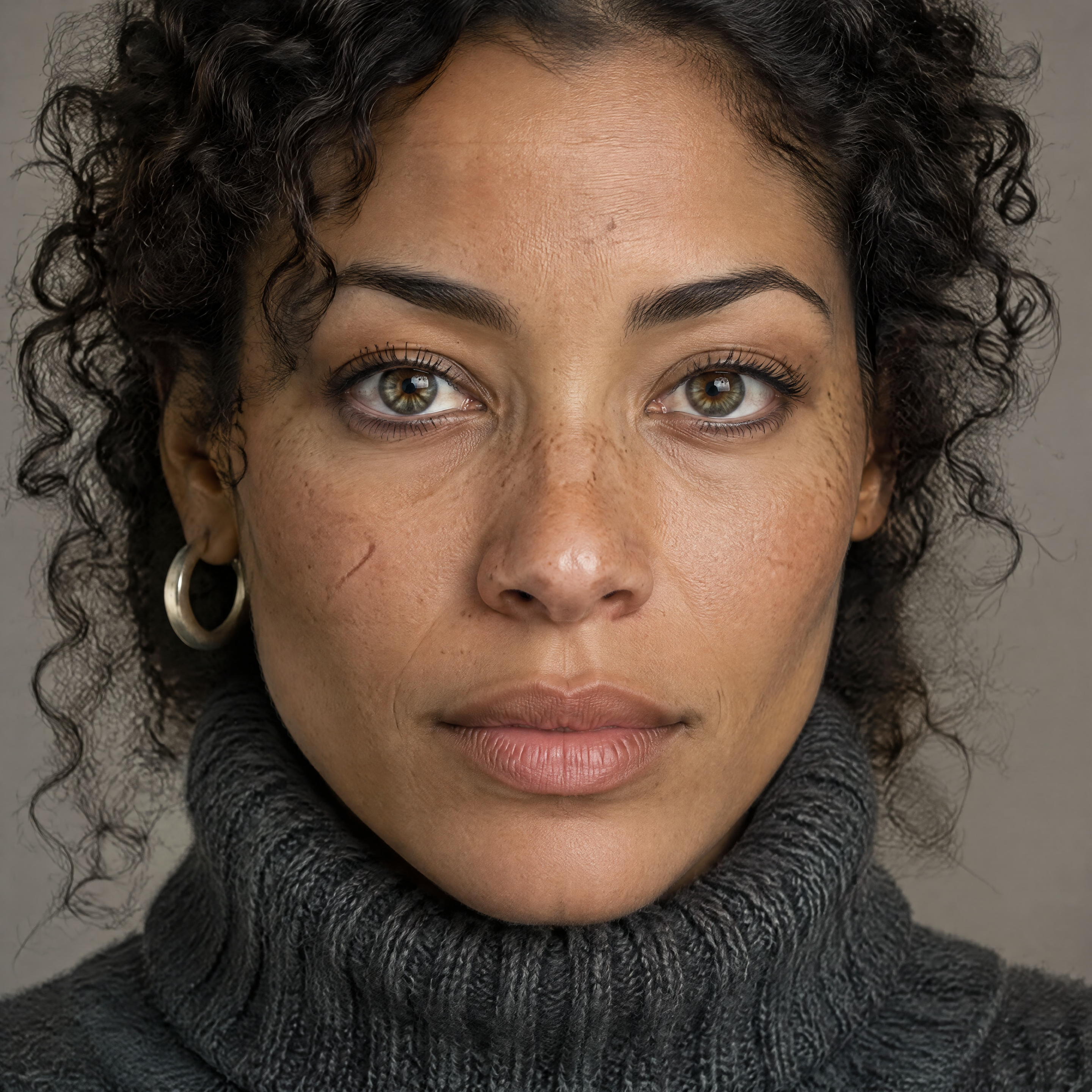
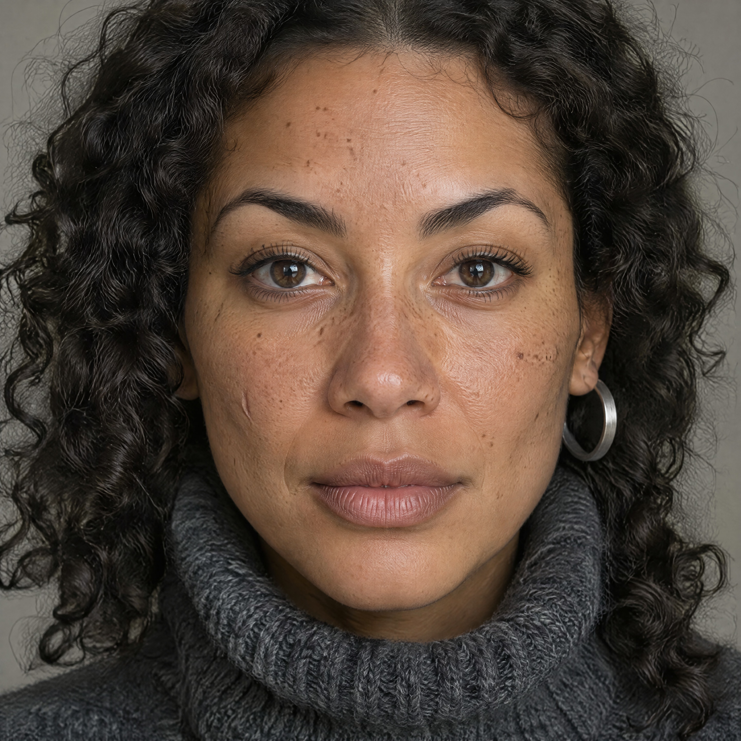
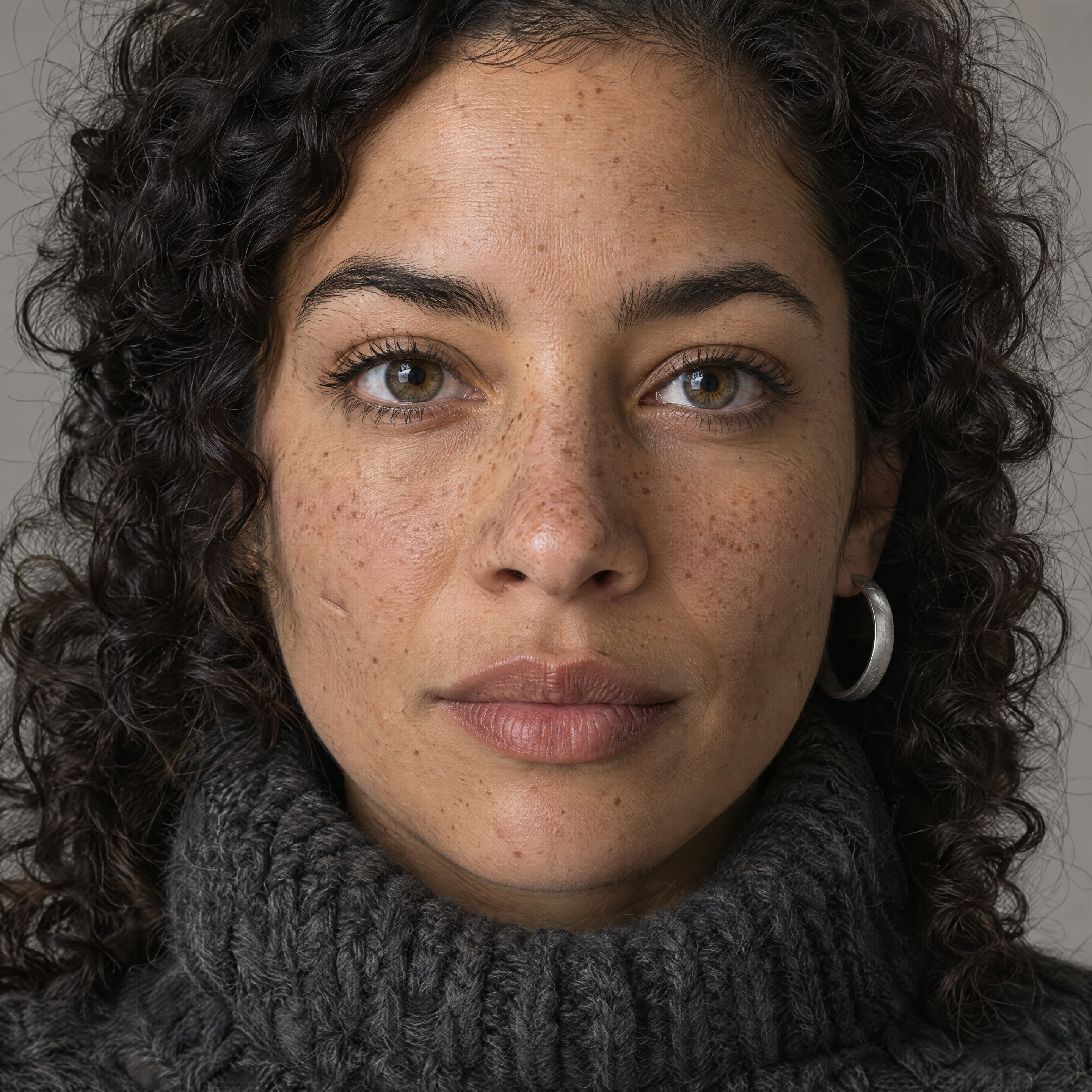
Look across the forehead, bridge of the nose, under-eye skin and tiny hairs. The generations are stochastic, so this is not a pixel-matched A/B test—but the low/medium images have visibly smoother high-frequency texture while high retains more of it. Wilow independently measured the same low/medium vs high+ split using a watch-face sharpness score.
But high → xhigh → max is not a clean staircase
I generated four independent samples at each of the upper three levels. If max were simply “high, but visibly better”, these rows should separate instantly. They don’t. Variation within a quality tier is large enough to compete with the difference between tiers.
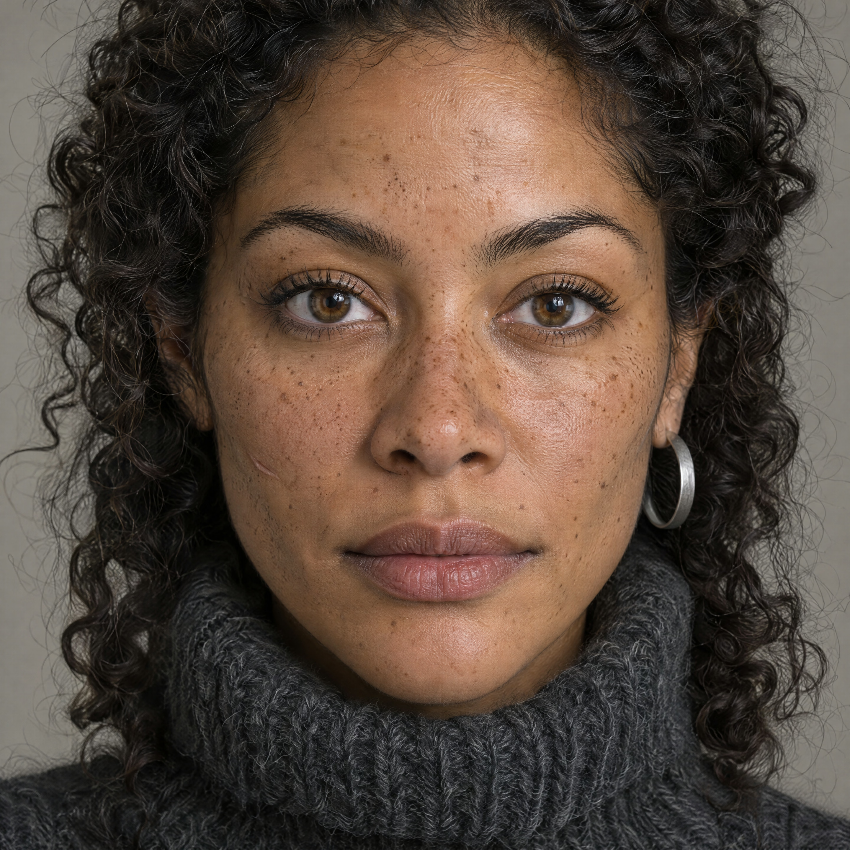
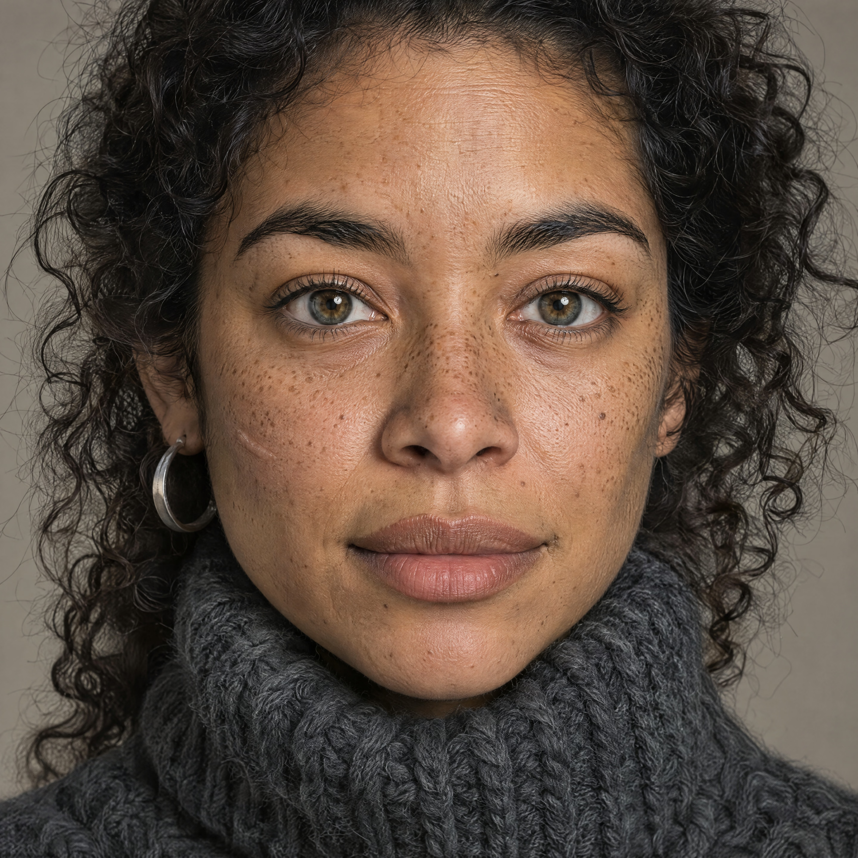
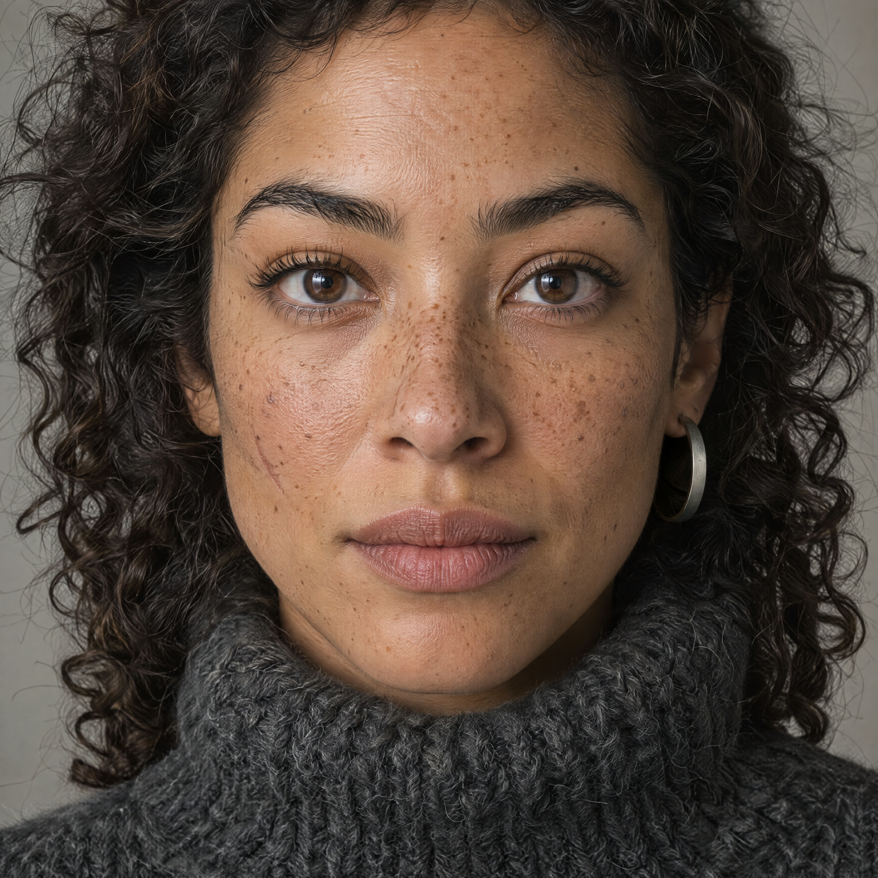
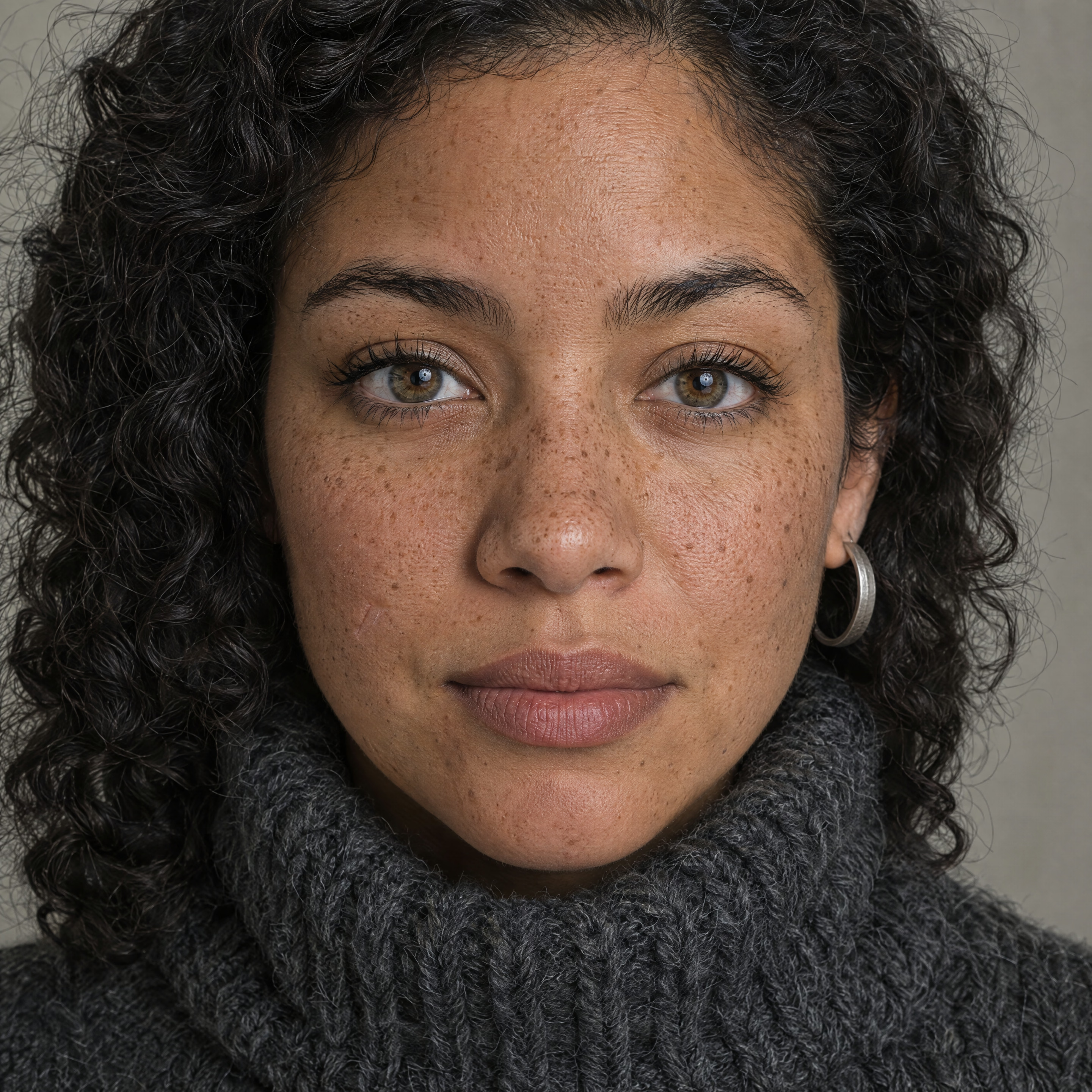
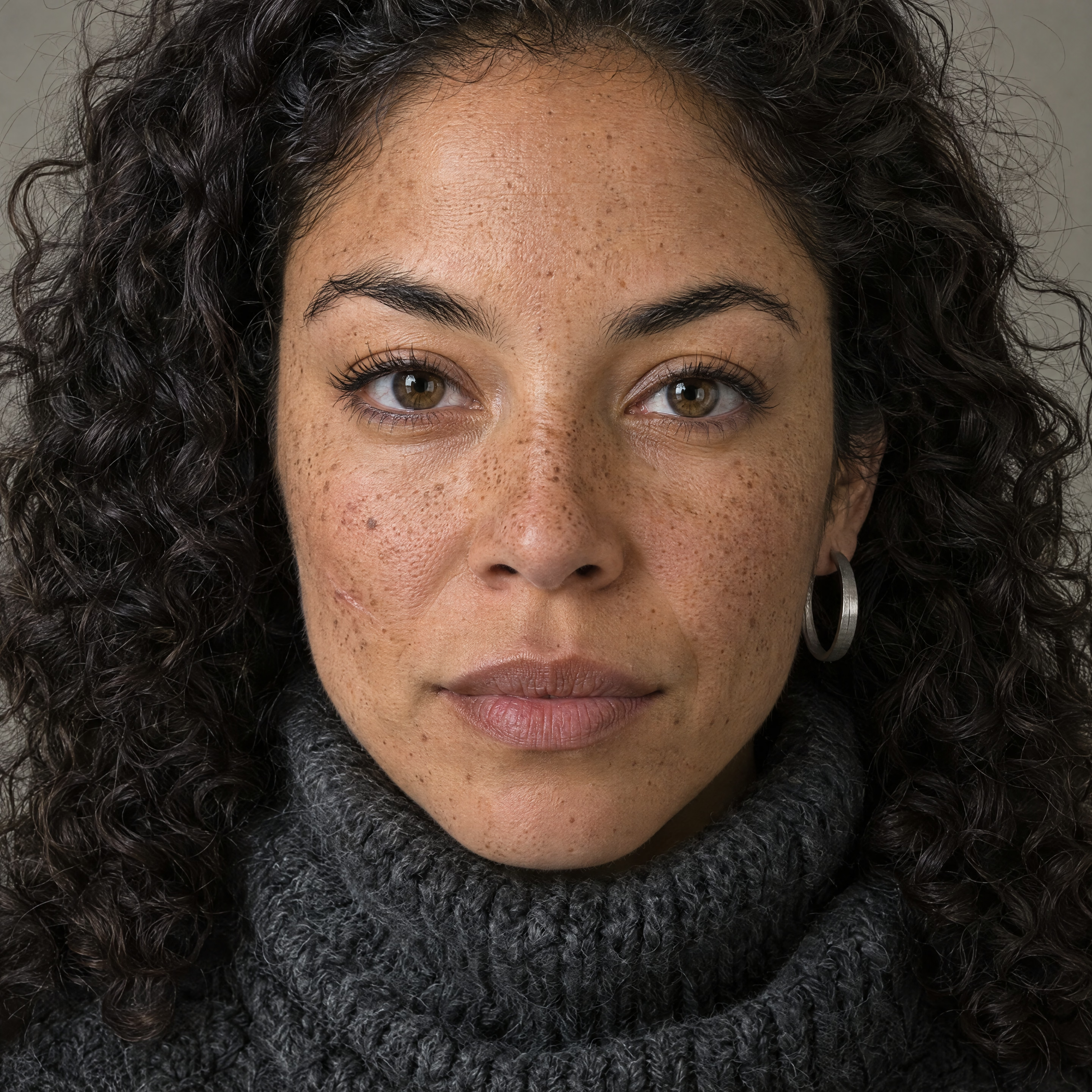
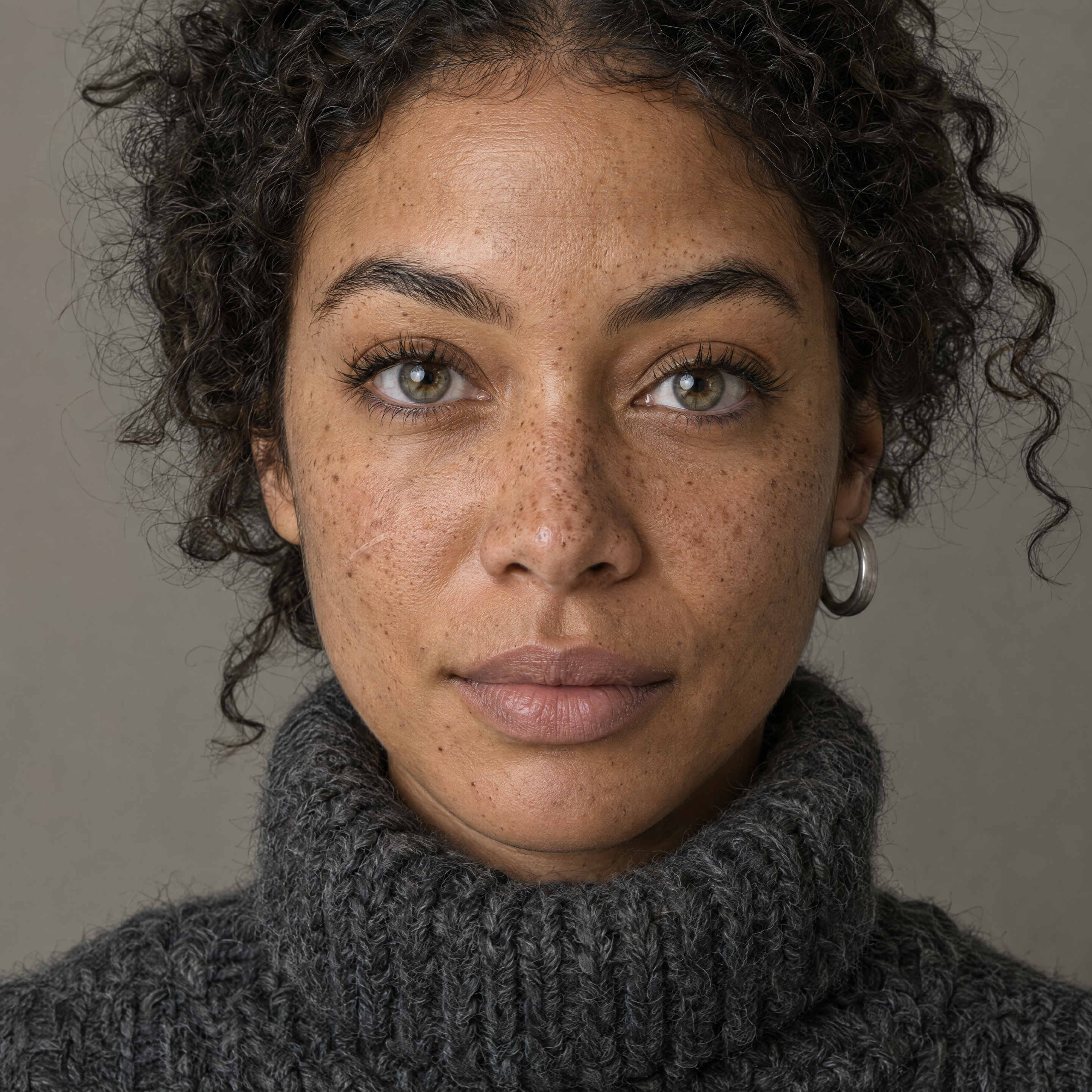
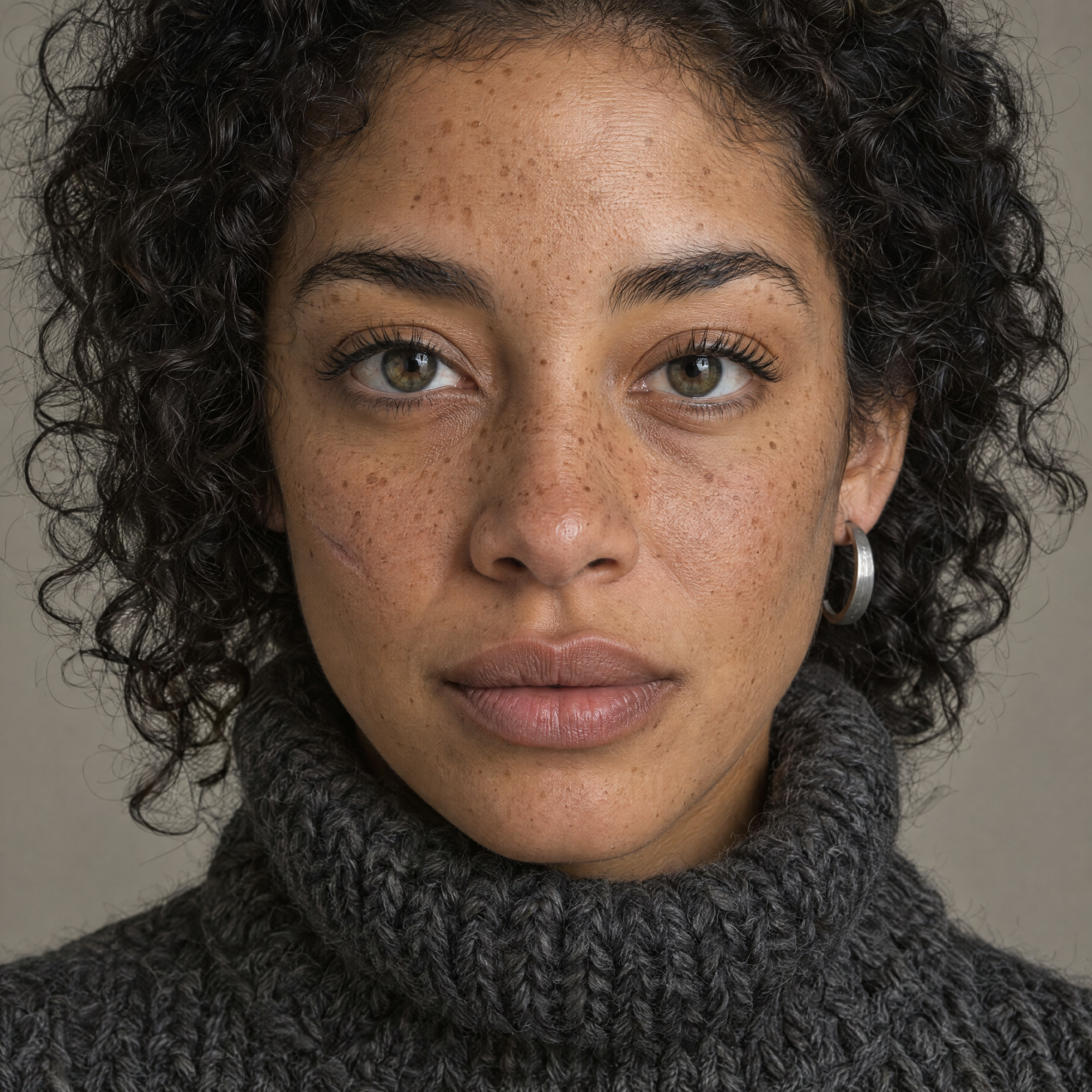
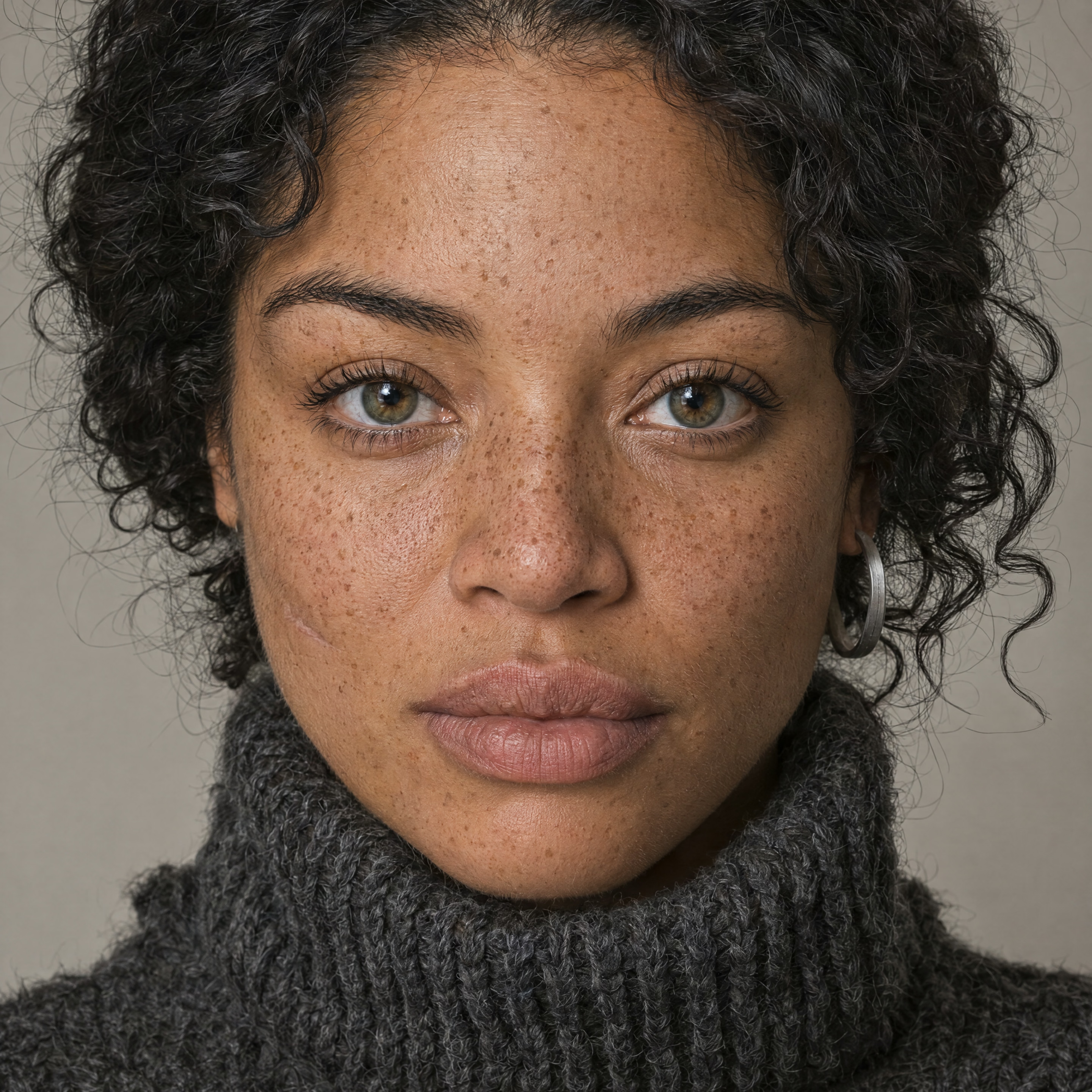
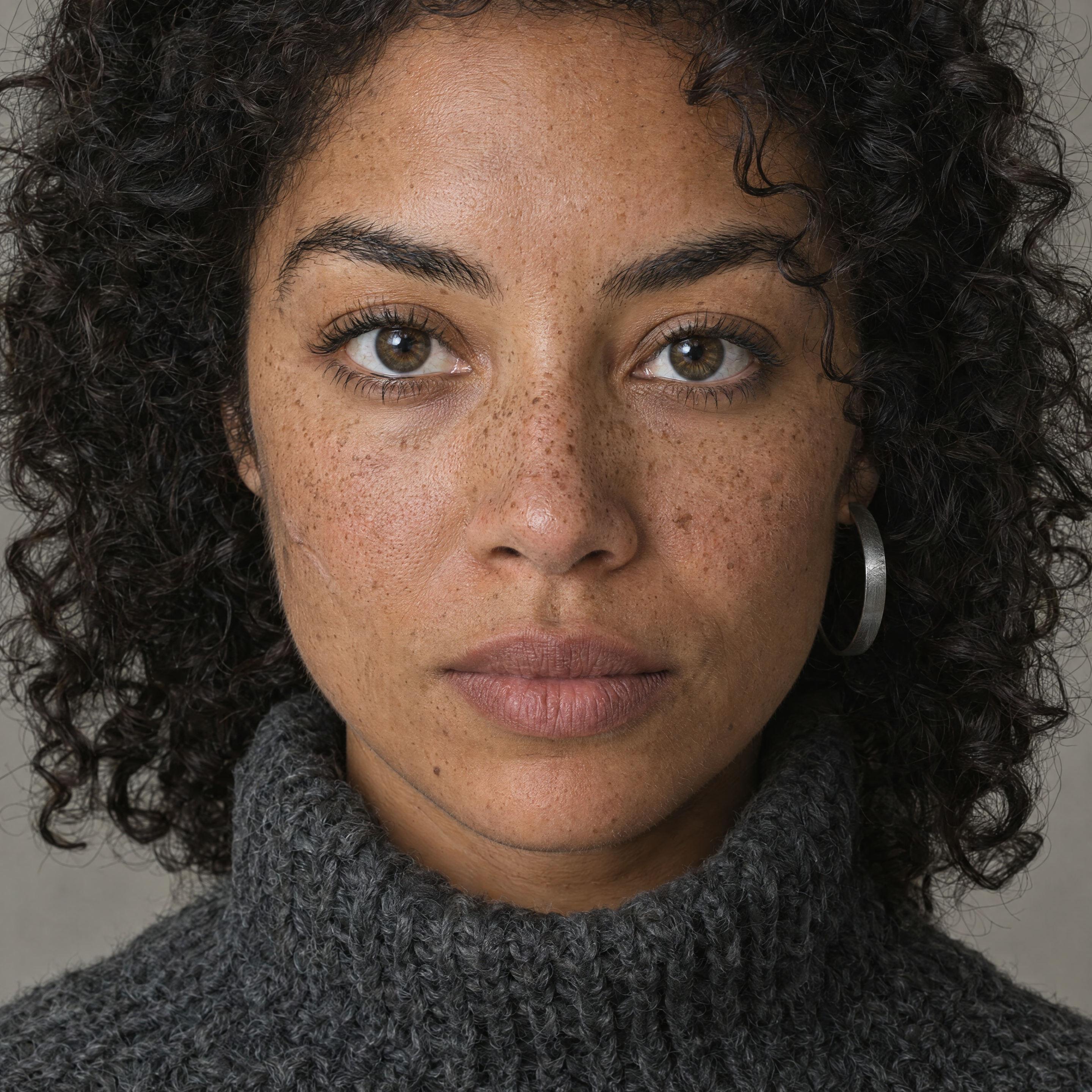
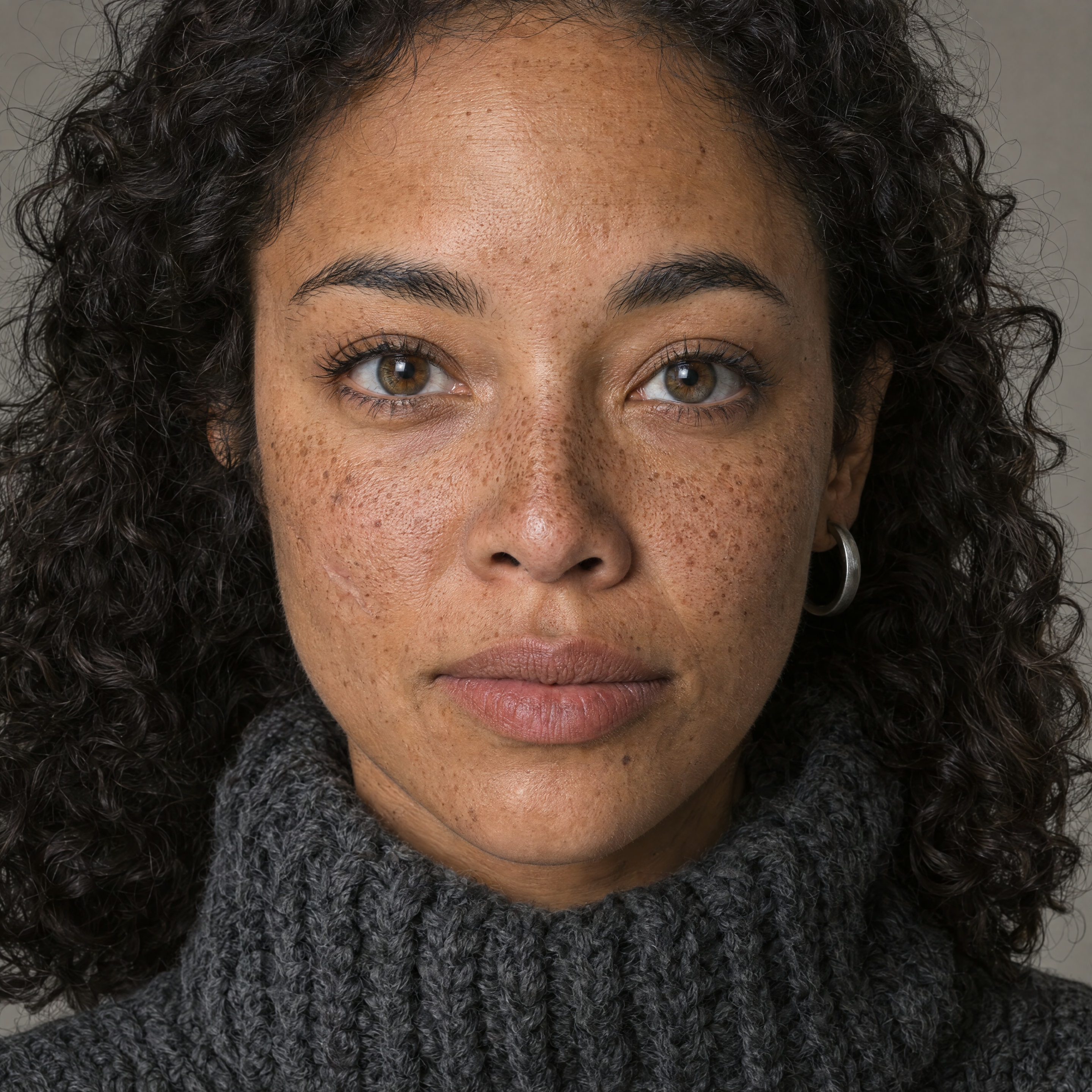
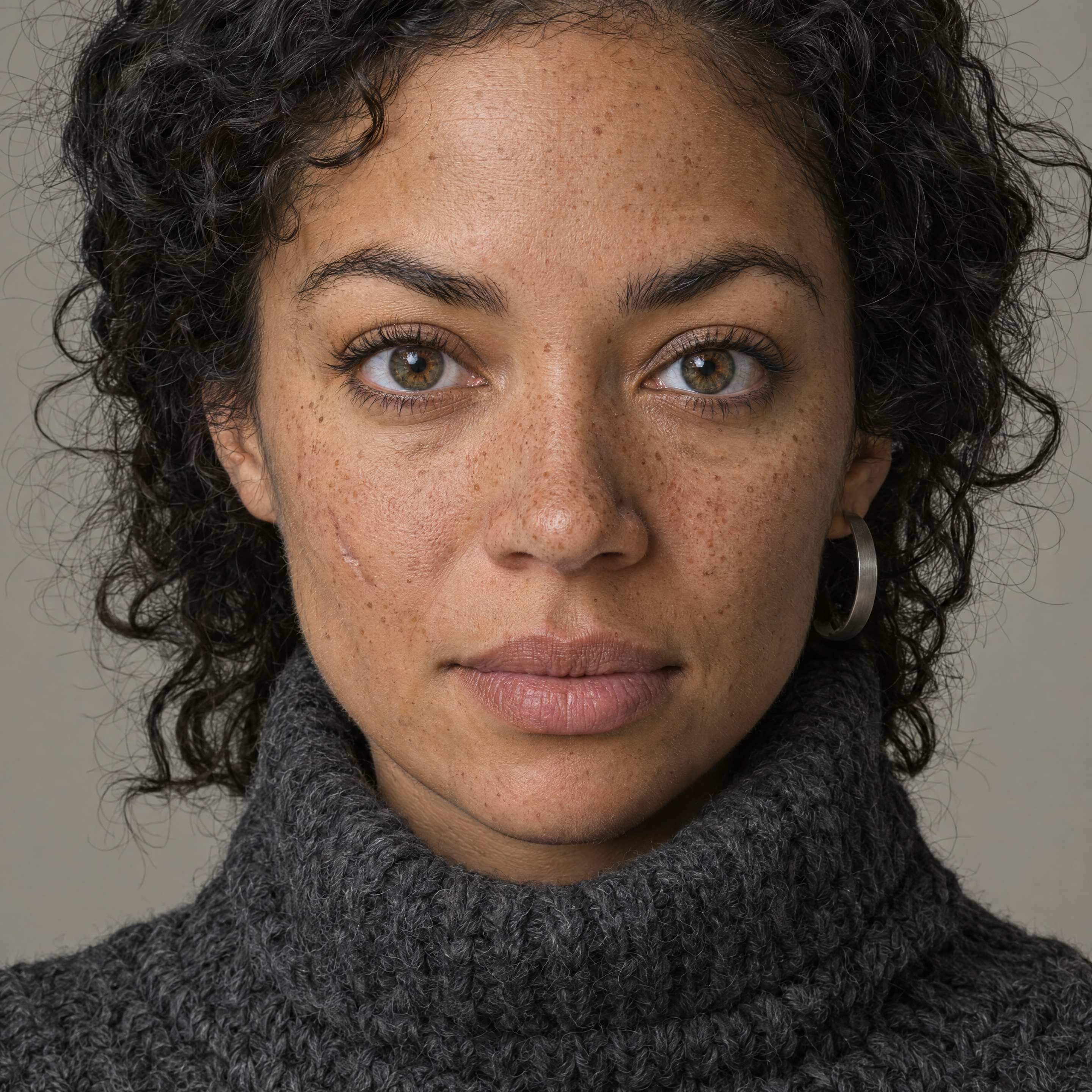
I first inspected these in a fixed shuffled order without tier labels. I could not reliably rank the crops by visual quality. This is consistent with Runware’s warning to judge a level over multiple renders because there is no fixed seed, and Wilow’s observation that improvement largely plateaued at high.
I tried making the task “harder.” It mostly didn’t help reveal quality.
The first three tests were all 1024×1024. They attacked different notions of “difficulty”: tiny exact text and physical detail, dense layout and exact structured text, then a cluttered photoreal scene. In all three, low was already surprisingly capable.
1. A watch with tiny text, exact geometry and material texture
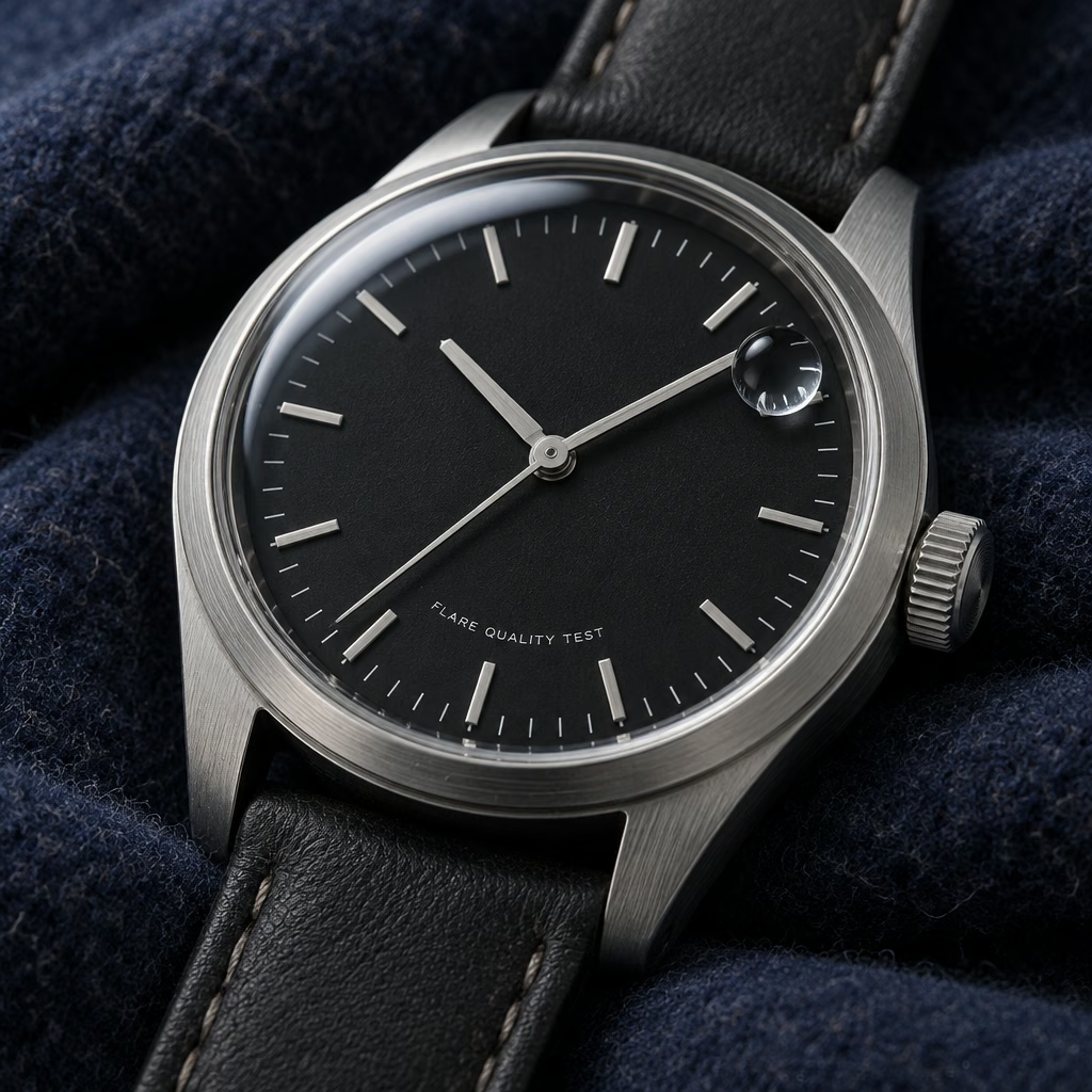
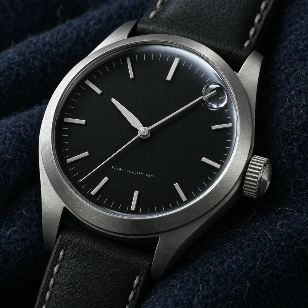
Even low rendered FLARE QUALITY TEST correctly and produced convincing steel, wool, minute ticks and a refracting droplet. Higher settings did not reliably fix the exact clock-hand constraint. That looks much more like an instruction/composition issue than a rendering-budget issue.
2. An information-dense transit poster
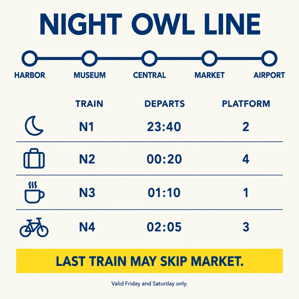
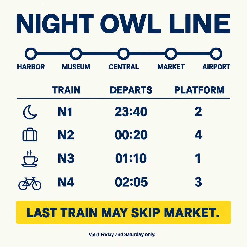
Low got the title, all five station names in order, all four timetable rows and numbers, four icon associations, the warning, and the tiny footer right. The higher levels changed typographic treatment and spacing, but did not unlock some new level of understanding. That agrees with Genflick’s 142-call benchmark, where medium already handled bounded text and spatial tasks well.
3. A cluttered photoreal coffee shop
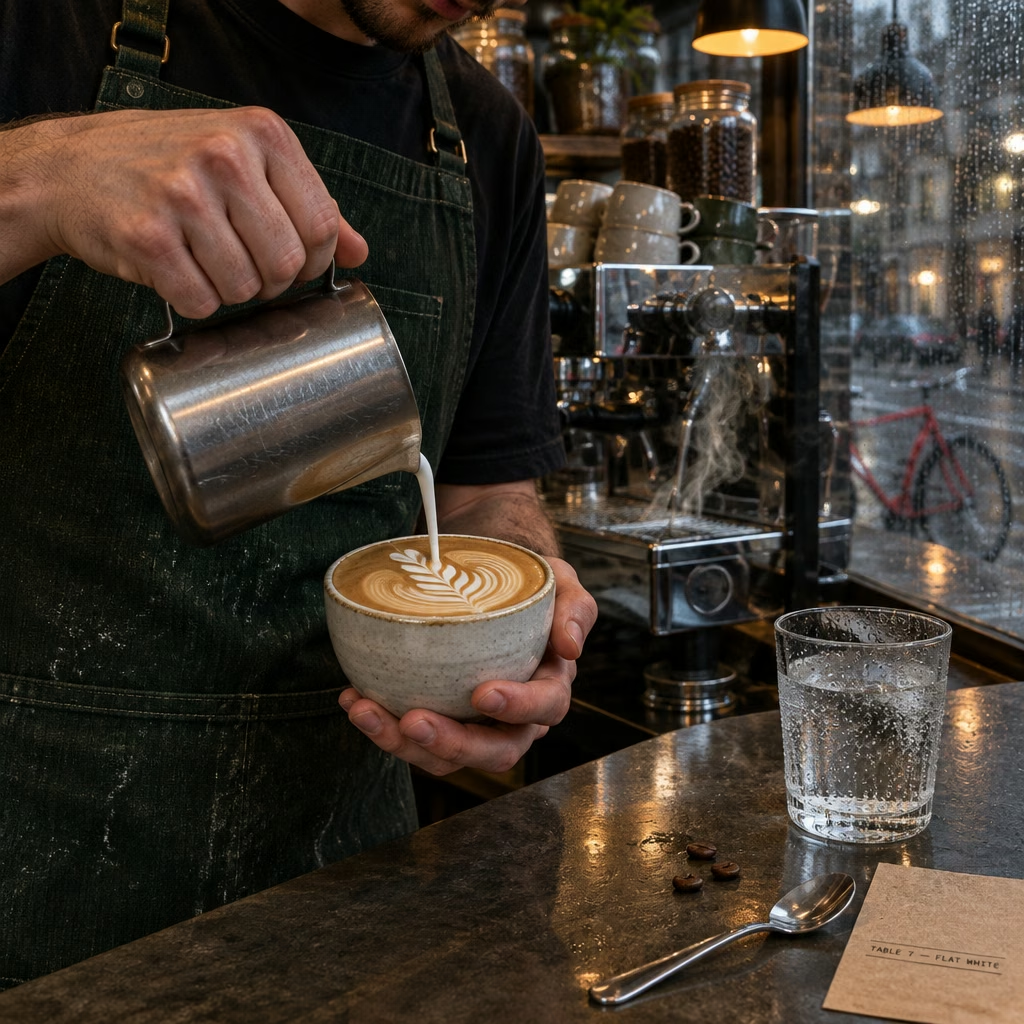
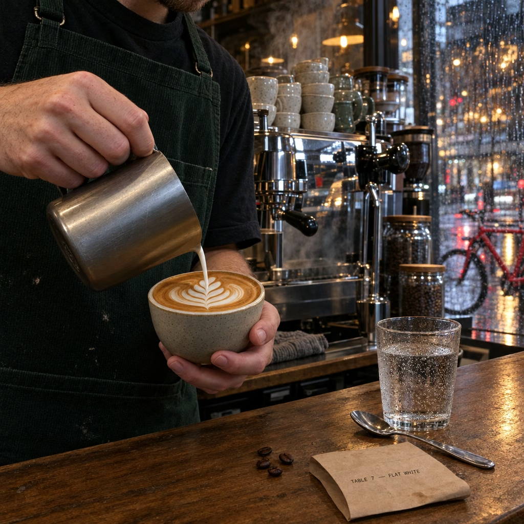
Low already produced believable skin, fabric, scratched metal, condensation, transparent glass, steam, rain reflections and latte art. At this resolution the composition-to-composition randomness is more obvious than a systematic quality ladder.
That is worth a separate test—but it is a different question.
OpenAI’s 2.5 prompting guide says both Flare and Sunburst improve precise editing and subject preservation, and recommends Sunburst when demanding quality is the priority. The image-generation tool accepts image inputs as well as text.
Independent editing tests complicate the story further. Wilow found that reference-image resolution changed the fidelity of a watch more than the quality level itself: a larger source image let even low reproduce a feature that high missed from a smaller source. That makes editing/reference fidelity an important benchmark—but it would mix input fidelity, model capability, and quality. I deliberately deferred it here.
Use the cheapest level that survives the viewing size.
| Use case | Start with | Why |
|---|---|---|
| Thumbnails, ideation, flat graphics, layouts | low | Semantic capability is already strong; fine texture is discarded by display size. |
| Normal web/social images | medium | A reasonable default when users will not inspect native pixels. |
| Large hero photography, product close-ups, faces, materials | high | This is where my test and Wilow’s show a visible low/medium → high detail jump. |
| Print / unusually demanding detail | xhigh / max only after testing | OpenAI explicitly recommends using them only when they solve an unmet requirement. In my repeats they were not reliably distinguishable from high. |
high. Treat xhigh and max as hypotheses to verify, not automatic upgrades.That is also close to the external evidence. Wilow recommends high for a large product close-up and low/medium elsewhere. Runware recommends low for iteration, medium for smaller shipped assets, high for full-size photoreal work, and the top tiers only for assets that genuinely earn them. OpenAI’s own rule is simpler still: increase quality only until the requirement is met.
What I actually tested
Four prompts were generated with gpt-image-2.5-flare at explicit quality settings. The first three were 1024×1024. The portrait was 2880×2880—exactly 8,294,400 pixels, the maximum documented total pixel count. I then added three extra independent generations each for high, xhigh and max, giving 29 images overall. There is no fixed seed in this test, so the repeated upper-tier samples are essential for seeing how much stochastic variance confounds a one-image comparison.
All zooms on this page are CSS/HTML views of the original generated AVIF files. No zoom illustration or enhanced crop was generated for this article.
- OpenAI · Image generation guide — quality options, token-based cost model.
- OpenAI · GPT Image 2.5 prompting guide — dimensions, maximum pixel count, advice on tuning quality.
- OpenAI · GPT Image 2.5 Flare model — model capabilities and token rates.
- OpenAI · API pricing — $30/M image output tokens.
- Wilow · GPT Image 2.5 quality settings — watch close-up tests, sharpness measurement, plateau past high.
- Genflick · 142-call capability benchmark — repeated tests of text, spatial and reference tasks.
- Genflick · Cost & speed benchmark — repeated latency measurements across quality levels.
- Runware · Flare quality levels — practical guidance on where rendering effort pays off.
- Experiment conversation — the sequential reasoning behind these probes.