imaging.py |
|
|---|---|
Image generation via Python Image LibraryLet's say we want to plot the Bank of England's historical interest rates as a graph. |
|
|
|
|
Load the Python Image Library |
|
|
Configure the output path |
|
|
Create a new RGB image of width 316 px (for 316 years of data) with color #E0E0E0 |
|
|
Save the image as a PNG. The extension determines the file type. |
|
|
Here's the result:
|
|
|
Now let' draw axes. |
|
|
Import the ImageDraw library that lets us draw on images |
|
|
Draw a line every 50 pixels. We'll use y = 0 - 200 to plot 0 - 20% rates. draw.line takes ((x1,y1), (x2,y2)) as a parameter. By default, it draws a white line. |
|
|
Here's the result:
|
|
|
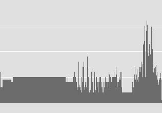
Now let's draw the actual graph. draw.line takes a fill= parameter where you can specify the colour. |
|
|
Here's the result:
|
|
|
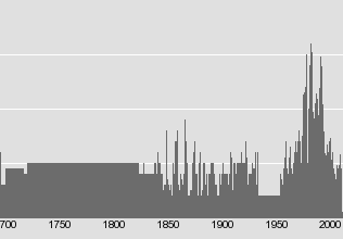
Now we'll text labels for the years |
|
|
|
|
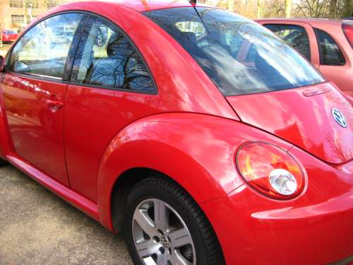
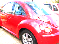
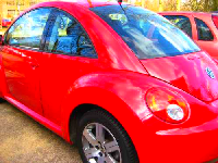
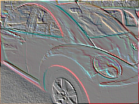
Image processing via Python Image LibraryPIL lets you manipulate the images as well. This is best shown via demos. |
|
|
|
|
|
Resize it |
|
|
|
|
|
Brighten and saturate the image |
|
|
|
|
|
For more samples, see ngimage |
|
|
Emboss it, or trace contours |
|
|
|
|
Image generation via SVGAnother option is to use SVG to render the file. This makes it look better on print. Some sample reports created this way are at Report Bee and KLP. |
|
|
We'll use tornado templates to render the file |
|
|
Create a basic template that'll draw a grey box |
|
|
Add the axes |
|
|
Add the graph |
|
|
Add the labels |
|
|
Generate the template and write the data |
|
|
Here's the result: |
|