VizChitra 2026 · Dialogue · A data-viz un-conference
The Curator's Dilemma
When an AI can draw any chart in seconds, what is a curator still for? Six charts, one unfair question, forty-two practitioners — and a slow, delicious unravelling of the idea that we agree on what "good" means.
S Anand, LLM Psychologist, Straive·VizChitra 2026, Bangalore·4 Jul 2026 · 10:00–11:10 am IST
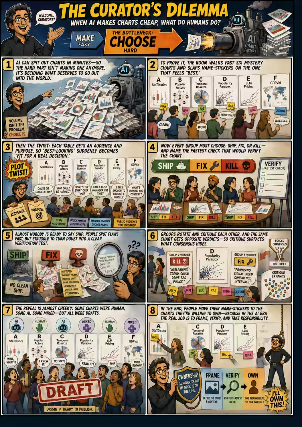
A visual summary of the session. Open full size ↗ · Built with ChatGPT from the transcript.
The inauguration had just finished down the hall, and the overflow was heading Anand's way. His room at VizChitra 2026 — India's un-conference for people who make charts for a living — held six tables. On each table lay a single visualization, printed large on A3 paper like a poster. He asked the participants to spread out, two or three per table, and to keep a small stack of cards face down. He was not going to tell them, yet, what any of the charts were — who they were for, what they were meant to do, or which had been made by a machine.
Then he apologised. Not for the charts — for the competition. Down at the main stage, Rohit Saran, an editor from the Times of India, was giving what Anand cheerfully insisted was the better talk:
"Possibly the second-best talk of the day is happening at the big thing. You absolutely should be at Rohit Saran's talk. I won't feel bad… strictly speaking, you will get more out of this talk than this session. But you don't have a choice — please associate yourself with some table in spirit."
— Anand, doing counter-programming in reverse
Someone offered to help: "We'll probably say no for other people and let them feel bad." Anand demurred — "they should be in Rohit's talk" — and then, fifteen minutes behind schedule, began. It is worth noticing what he'd already done. Before a word of theory, he had staged the entire problem in miniature: a room full of experts, a pile of charts of unknown origin, and a nagging sense that you have to decide something without quite knowing what you're deciding. That is the curator's dilemma, and by the end of the morning almost everyone in the room would feel it in their stomach.
The premiseTaste was supposed to be ours
A year earlier, Anand had a comforting answer to the anxiety of the age. Yes, AI could churn out charts on demand — but taste, the knack for making a good chart, would surely stay human. Twelve months on, he was no longer sure. The machines had started producing charts that were not merely competent but, occasionally, rather good.
"AI has made what we thought was really easy a little harder, and what we thought was really hard a little easier."
— Anand, on the great inversion
So he offered a new hypothesis, and framed the whole session as a wager on it. If taste is no longer the moat, what is? His guess came in four parts — the things he suspects will still belong to humans when the dust settles. Framing the purpose: deciding what a chart is for, and for whom. Testing the claim: checking whether the thing is actually true. Choosing among trade-offs. And owning the result. Purpose, he argued, is not really a technical question at all — it is a choice, like preferring vanilla to chocolate:
"It's not about right or not; it's about choice. And in that case, it's hard for AI to take that over — because there's no necessary right answer."
— Anand
Ownership was the part he lingered on, because it is the strangest. We have no idea, yet, how to reward or punish an AI. But we are very good at holding durable entities accountable — that is what companies are for. And the law, he noted with obvious delight, has gone further still: in some jurisdictions a river can hold assets, a temple can own property, and a ship can be taken to court as a legal person in its own right. One day, he predicts, we will legislate AI the same way — give it a bank account, a fine, a death sentence. Until then, accountability has to rest on a human neck.
"If you want a neck to catch, I am that neck. If something goes wrong, I stay accountable for it. And if it needs to be corrected, I will correct it — I am that person."
— Anand, defining ownership
The experiment · Act 1The beauty contest
Now the unfair question. Anand asked everyone to walk the room, look at all six charts — no context, no captions, two minutes flat — and stick a post-it with their name on the best one. He told them to imagine the least reflective version of their job:
"Think of yourself as a very busy editor of charts. 100 people have given you AI-generated charts. You have exactly two minutes to decide. However you're going to pick — just pick, move on."
— Anand, manufacturing a snap judgment on purpose
When the names were up, he asked why. The answers came fast and are worth reading as a set, because together they are a confession: "It looked the cleanest." "Easiest to understand." "It was very clear." "It gave context." "It didn't have an obvious mistake." "Too much text overlapping, so you could tell nobody thought about it — that was a smell." And then one answer that made Anand stop:
"It had a lot of text with a call to action — so that makes it the easiest to verify."
— A participant, accidentally naming the theme of the whole session
"Easy to verify," Anand repeated. "So — ease not just of understanding, but of verification." Hold onto that word. It is going to come back and quietly demolish the room.
Here is the thing about that first vote: it measured the wrong thing beautifully. With no task in mind, people rewarded whatever survived a hurried glance — clean, familiar, legible. Three of the six charts collected 78% of the names. The strange one almost nobody could parse, and the dense one that demanded work, were nearly ignored. That is not a ranking of chart quality. It is a measurement of glance-fluency — of which poster rewards you for not thinking. And, as Anand was about to show, glance-fluency and fitness-for-purpose are not remotely the same thing. One participant had already sensed the ground shifting under her:
"You have no idea how much I don't know about charts anymore."
— A participant, after reading the first context sheet
The six charts
Each was printed as an A3 poster and laid on its own table. Click any chart to enlarge, or open the live version. The purpose and audience below were revealed only after the first blind vote. The yellow strip on each card is a stack of real post-it notes — click it to read exactly what each person wrote when deciding whether to put their name on that chart.
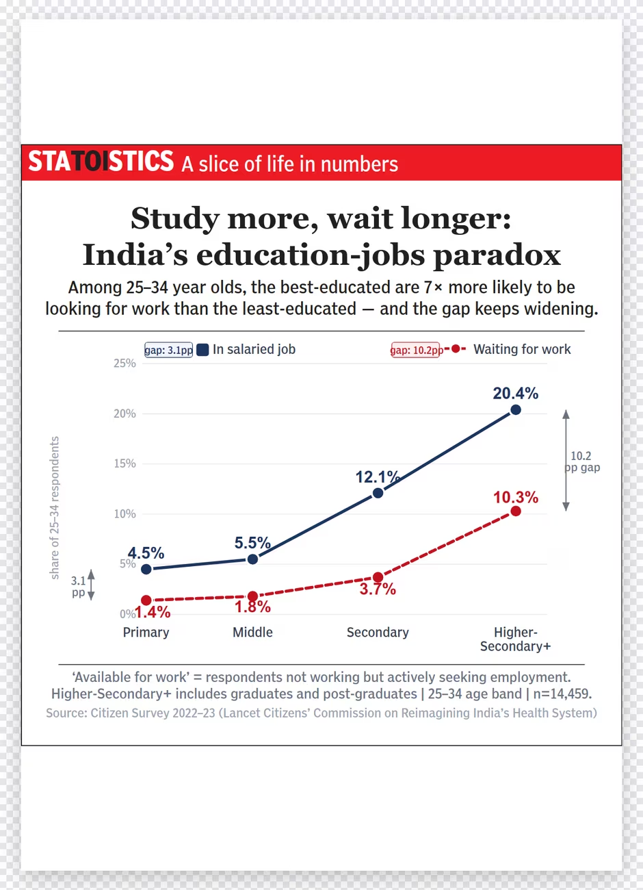
AStatoistics
Purpose: make a policy recommendation — should a state shift funding from higher education toward job creation? Audience: state education & labour officials with two minutes and one question: causation, or just correlation?
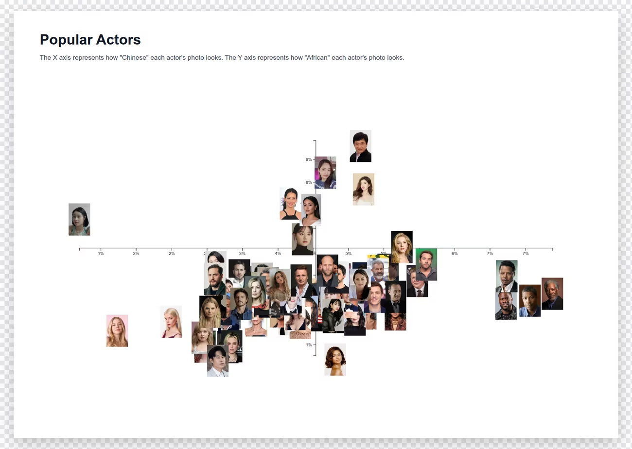
Purpose: audit an image-embedding model — useful pattern, or reproduced stereotype? Audience: an AI fairness & product-risk committee asking what the axes really measure, and who is harmed if they're wrong.
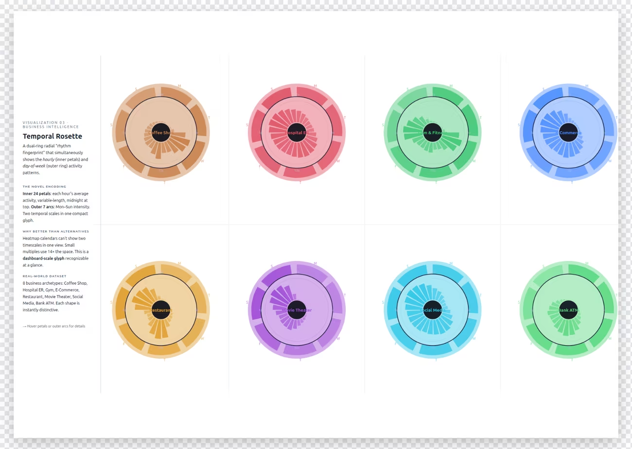
Purpose: help a shopping-centre manager compare weekly rhythms and schedule staff. Audience: a busy, non-technical operations manager who'll use it every Monday — if repeated use makes the work easier.
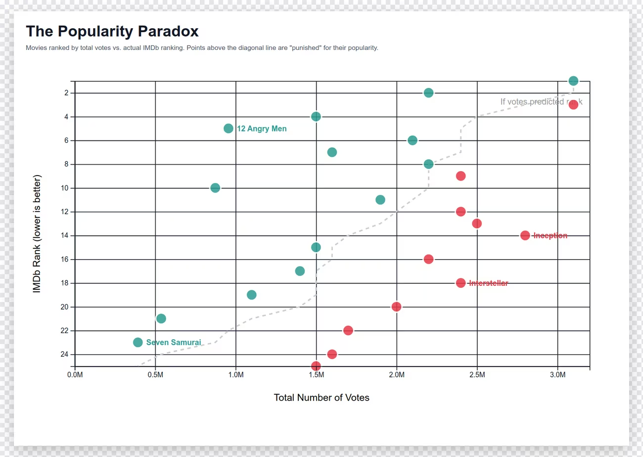
Purpose: publish a defensible cultural insight — that popularity and IMDb ranking measure different kinds of approval. Audience: data-literate culture journalists who'll pounce on cherry-picking and causal language.
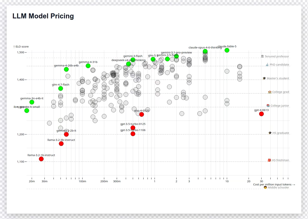
Purpose: recommend a default LLM for a 200-person software team for three months. Audience: an engineering leader who also owns reliability, privacy, latency and migration — and needs to know if this chart is even enough to decide.
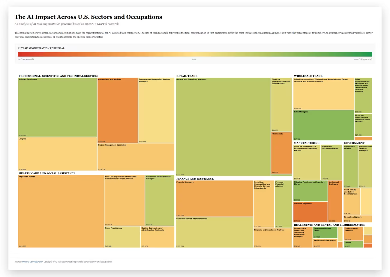
Purpose: pick three occupations for AI-assistance pilots next quarter. Audience: a chief transformation officer and HR leader who care about impact, feasibility, risk — and what's missing before they invest. Based on OpenAI's GDPval.
Anand handed out context sheets — a purpose and an audience for each chart — and the room changed key. The prettiest poster suddenly had to answer a question. He gave each table a mantra to work through: FRAME → TEST → CHOOSE → OWN. A chart, he insisted, is never good in the abstract. It is good for someone, for something, under particular consequences — the same idea the data-journalist Alberto Cairo built a whole book around: a visualization is functional art, judged by the job it does. And then the real task: as a table, reach one verdict.
The decision, forced onto a single sheet
SHIP · FIX · KILL · VERIFY
SHIP — for this audience and purpose, is it good to go? FIX — what is the single highest-value change? KILL — what would make you refuse to publish? VERIFY — what is the cheapest decisive check that would earn your approval?
Nine minutes. One sheet. You may mark on the chart. Put yourself in the mindset of an editor whose name goes on it.
He added two provocations that turned a design review into an ethics seminar. First: a kill does not require a fatal flaw — recreation is a kill. If you'd rather rebuild it from scratch, you've killed it. Second, and sharper, aimed at the table holding the actor-photo scatter:
"If you believe that, for this particular audience, sharing this could actually cause racial-discrimination harm — you kill it."
— Anand, on when a chart should simply not exist
And a question that is really the entire craft compressed into a sentence: "Suppose a person took a quick glance, like you did — what incorrect, hurried conclusion might they draw?" Not "is it correct" but "how will it be misread by someone as busy as you were ninety seconds ago." The tables argued. Someone asked whether they were allowed one fix or many ("Two max, please"). Someone else asked the question Anand loved most and couldn't answer: what should the learning curve be — an hour, a week, a month?"That is exactly what I'd love to learn from you," he said. When the sheets came in, a pattern was already visible. Not one table said SHIP.
What each table decided
Zero ships. Three fixes. Three kills.
Chart
Verdict
Reasoning on the sheet
How they'd verify
A · Statoistics
Fix
Split state-wise, add state job numbers, flag "correlation only, not causation," call for formal-sector expansion.
"State job numbers; state education numbers."
B · Popular Actors
Kill
"Does not answer the question. Axes & reference groups not clear."
"Axis label not there; no reference groups."
C · Temporal Rosette
Kill
Multiple fixes: font, labels, the time-of-day / day-of-week correlation.
"?"
D · Popularity Paradox
Fix
Rating instead of ranking; name the outliers; fix the correlation line; more data points.
"Verify IMDb Nos."
E · LLM Pricing
Fix
Fix the cost axis, the legend, the overlapping grey circles.
an attempted method — struck through.
F · GDPVal
Kill
"Too many things to fix. Not a fit for the audience."
"I don't know."
From the tables' handwritten sheets.
The zero-ship result sounds damning until you learn the twist Anand was saving: every one of these charts was a draft. None had been through a serious editorial process. So "nobody would ship" is not a failure of the charts — it is the room correctly smelling that these were unfinished. The interesting question is not whether they'd ship, but whether they could say precisely why not.
The experiment · Act 3Switch tables, and be kind
Now the rotation. Each group moved one table to the right and inherited a stranger's decision — their chart, their audience, their handwriting. The instruction was disarmingly gentle: critique their decision, but in a nice way. By which Anand meant something precise: find the strongest reason their verdict might be wrong.
"On a new sheet, write: 'The strongest part of their decision is X. We would change it, if at all, for this reason.' You can also say: 'Fantastic work, no changes.'"
— Anand, teaching adversarial generosity
And here the session produced its first genuinely surprising result. Given the same chart, the same audience, the same purpose, groups didn't just tweak each other's reasoning — they reversed the verdict. Three of the four decisions that got a clear second opinion flipped category. The Statoistics table's Fix was argued down to a Kill. The actor-scatter's Kill was argued up to a Fix. The most quotable defence of that reversal:
"Don't kill it! The graph is fine as long as you fix the labels. Actually, it shows how absurd the model is — so the model is wrong, but the chart is fine, because it reveals it."
— A participant, defending the actor-photo scatter
Read that carefully, because it's the crux. The two groups were not disagreeing about aesthetics. They were arguing about which layer was on trial. One group put the chart in the dock; the other put the model in the dock and treated the chart as the prosecution's best exhibit. Both are coherent. They just answered different questions. Anand named the deeper point:
"What we think may not be what someone else thinks, even given the same information. But that is the power of subjectivity — and therefore the thing AI will not be able to take. Because if the human training data is in disagreement, what constitutes 'right' becomes very different."
— Anand
The revealWhich ones were the robots?
Only now did Anand turn the cards over. Which charts were AI, which human, which hybrid? The answer scrambled everyone's assumptions — and, tellingly, barely mattered.
A · Statoistics
100% AI
Zero human intervention. Anand had seen it for the first time the day before. It also won the beauty contest.
B · Popular Actors
100% human
Anand wrote every line — laid out with image embeddings, not by hand-placing dots.
C · Temporal Rosette
100% AI
From the prompt "create a visualization nobody has ever seen — in fact, half a dozen." Anand's verdict: "I have no idea what it's saying."
D · Popularity Paradox
~50% AI
He gave a theme, the AI made the chart, and he published the output without reviewing it.
E · LLM Pricing
100% human
Every bit hand-coded — models plotted by ELO score against price per million tokens.
F · GDPVal
~50% AI
"Scrape the data, build a treemap" — the AI did the gathering; Anand shaped the ask.
Sit with the top-left corner of that grid. The chart the room loved most, on a blind glance, was the one no human had touched. The strange, unreadable rosette and the machine-scraped treemap sank to the bottom — not because they were AI, but because they were unfamiliar or dense. When Anand later traced who moved their name after the reveal, only five of thirty-four people switched charts, and not one crossed the line between a human-made chart and an AI-involved one. Provenance, the thing everyone worries about — the thing whole standards like C2PA exist to certify — turned out to be almost irrelevant to judgment. What mattered was familiarity, clarity, and fitness — reviewed versus unreviewed, verifiable versus merely asserted.
The stickiness of opinion
Each ribbon follows the 34 people whose name we could track from their first blind pick (left) to where it finally came to rest (right). Grey ribbons stayed put; crimson ribbons moved. Hover a ribbon for the names; click a chart or a ribbon to read every note. Charts are coloured by who made them.
AI-made (A, C) Human-made (B, E) Hybrid (D, F) Stayed Moved their name
Only 5 of 34 switched charts — and every mover stayed on their own side of the human/AI divide (AI→AI, AI→hybrid, human→human). The exercise changed arguments far more than it changed allegiances.
"In all of these cases, they are drafts. None went through a strong editorial process — and that is exactly what you are learning, bringing in, discussing."
— Anand, on why nothing shipped
A true storyAnand, we may have to shut it down
To show what "the problem has moved" really means, Anand told on himself. The Statoistics property — the Times of India "slice of life in numbers" series — had nearly died for want of hands. Rohit, the very man drawing the crowd next door, had told him: "Anand, we'll probably have to shut it down, we don't have enough people." So Anand pointed an AI at it — "ChatGPT, create a whole bunch of these Statoistics; now take these ideas and implement them" — and the bottleneck simply teleported somewhere else.
"Now we don't have enough people to review and validate. We made that simple. Now we don't have enough space to print. The problem completely shifted — and it's still shifting."
— Anand, on the whack-a-mole of abundance
He'd already seen the next stage in the wild. He once asked ChatGPT to open a pull request against an open-source tool. Within minutes, three other bots had submitted competing pull requests for the same issue — all jostling to get merged. Creation, he said, is no longer the bottleneck. Anyone — any thing — can now flood you with plausible work.
"The ability to create is now so cheap, and the quality is not bad, that any Tom, Dick and Harry will start creating. Which means our job has become verification."
— Anand
The gapEveryone could criticise. Almost nobody could test.
Which brings us back to that word from the very first vote — verify — and to the quietest, most important finding of the morning. Anand had explicitly asked every table for "the cheapest, quickest, easiest check" that would verify its chart. The room was excellent at spotting weaknesses: missing denominators, causal overreach, harmful framing, dangerous misreadings. But when it came to a reproducible test, the sheets went vague. By a strict standard, not one of the six tables produced a real verification procedure.
Look again at that column in the table above. "State job numbers." "Verify IMDb Nos." A question mark. A struck-through attempt. "I don't know." These are not tests. They are intentions. And the difference is the whole ballgame:
"Check the IMDb numbers" is an intention. "Download this file, filter these records, recompute this field, and expect this result within this tolerance" is a test.
— The distinction the room kept missing
The maddening part is that Anand had the missing pattern in his pocket the whole time. When the Times of India team needed to trust his AI-made charts, they didn't stare harder at them. They asked him to make them checkable. So Codex generated a recipe: go to this spreadsheet, this column, filter by this value, and the sum of this other column will exactly equal my number. Follow the steps; the number falls out. That is verification as a designed artifact, shipped alongside the chart — and it points to a conclusion stronger than "humans will check AI's work":
The reframe
Verification is a thing you build, not a stare you give
The scarce skill isn't spotting that something might be wrong — the room did that well. It's turning a doubt into a cheap, decisive, reproducible check that anyone can run. The human's job is to run it, challenge it, and sign off — not to squint harder. This is exactly how the NIST AI Risk Management Framework treats test-and-verification: as a lifecycle activity with named, accountable owners, separate from the people who built the thing.
And it exposes a second, more insidious habit — the ritual that lets us feel safe without being safe. One of the most revealing post-its of the day approved the Statoistics chart for a single reason:
"Yes — because it has had human eyes before publishing."
— A participant's post-it, on chart A
But the very table that owned that chart had produced only vague verification intentions, and the critics had flagged a possibly decision-reversing omission: informal and non-salaried work, the huge category the chart quietly ignores. "A human looked at it" had become a substitute for knowing what they looked at, what would have made them reject it, and who fixes it later. The phrase to carry out of the room:
Human eyes are not a verification protocol.
— The morning's hardest lesson
The hidden dataOne sheet, many minds
There's a subtlety in how the session was built that produced a small revelation. Each table had to write one verdict — so consensus was forced. And forced consensus is tidy but dishonest: it hides the argument that produced it. You could see the seam in real time. The person presenting the actor-scatter's Fix verdict immediately added that, personally, they might still Kill it. The group had spoken; the individual quietly disagreed with the group.
The post-its confirmed it at scale. No table chose SHIP — but among the legible individual verdicts at the end, 14 said "Yes," 3 said "Yes, if…," 7 said "No," and one was unsure. "Nobody would ship" was a group fact, not a personal one. Rotation did the opposite of consensus: passing a decision to a fresh table decompressed the disagreement that the single sheet had squeezed flat. The lesson isn't "consensus is bad" — a famous 5,180-person experiment found that deliberating in small groups and then aggregating beat the raw crowd. The lesson is sequencing: decide privately first, deliberate second, and don't let the group erase the votes that went into it.
The individual verdicts hiding inside the group ones
0tables that voted SHIP
14individuals who wrote "Yes" anyway
3 of 4critiques that flipped the verdict category
0 of 6tables with a reproducible verification test
Anand's own post-session analysis of the placements and sheets.
The experiment · FinaleWould you put your name on it?
For the last exercise, Anand asked everyone to return to their post-it and do one thing: decide whether they were willing to own the chart their name sat on. Not "is it pretty," not even "is it right," but the ownership question in three tenses — before (anticipate the likely conclusion and the dangerous misreading), during (decide what evidence or review is required), and after (correct it visibly, and fix the process, if it fails).
"Would you put your name on this version? Write 'Yes,' 'No,' or 'Yes, if…' You may move your name. Changing your mind from evidence is success. Defending your first impression is not the objective."
— Anand, on the point of the whole morning
Most names didn't move — placements were sticky. But stickiness understated the change, because minds moved even when post-its didn't. One participant, Disha, kept her name on the Popularity Paradox and wrote beside it: "No — changed my mind." That is the session working perfectly: she stayed with her chart and abandoned her certainty. Others were admirably honest about the ownership they were taking on. "Yes — I can understand this one in under 30 seconds.""Yes, with fixing.""No — can't see everything, very cluttered. Very controversial!!" And, on the AI-scraped LLM-pricing chart, the four words that are the entire thesis of the morning: "Yes — would take ownership."
"AI may still get it right. But it's your name on it."
— Anand
Then, with the sort of timing you couldn't script, the session revealed its own running joke. Anand had been pacing himself for a leisurely ninety minutes. Someone pointed at the programme. It was a forty-five-minute slot.
"Sorry — I realise we are way over time. What I assumed was a one-and-a-half-hour session is apparently a 45-minute session. So we're wrapping up like crazy."
— Anand, discovering he had double-booked his own clock
It was a fitting way to end a dialogue about abundance and constraint — the facilitator, running long on a session about running things down to a decision. But the takeaway he left them with was not about time. It was about what survives when creation costs nothing:
"Ownership will last in the AI era. Accountability will last. Reviews and validations will last, at least for a few years. You might as well practise it. And practising is easy: delegate everything to AI — and what's left is what you have to learn."
— Anand, closing the dialogue
Top Takeaways
Six things to carry out of the room
01 · Frame
"Best chart" is an ill-posed question
Without a task, people reward glance-fluency — clean, familiar, legible. Three charts took 78% of the blind vote. A chart is only good for someone, for something, under particular consequences. Reveal the purpose first.
02 · Provenance
AI-vs-human wasn't the story
The blind favourite was 100% AI. Only 5 of 34 moved their name after the reveal — none across the human/AI line. The real axis isn't machine-made vs hand-made. It's reviewed vs unreviewed, verifiable vs asserted.
03 · Verify
A test, not an intention
Zero of six tables produced a reproducible check. "Verify the IMDb numbers" is a wish. "Download this, filter that, expect this value" is a test. Ship the verification recipe with the chart — the way the ToI team demanded.
04 · Beware the ritual
Human eyes aren't a protocol
"It had human eyes before publishing" approved a chart with a decision-reversing omission. Human-in-the-loop only means something if you can say what was checked, what would fail it, and who corrects it later.
05 · Declare the object
Same brief, opposite verdicts
Groups flipped 3 of 4 decisions on identical charts — because they were judging different layers: the data, the claim, the model, or the downstream decision. Before reviewing, say out loud which one is on trial.
06 · Own it
Your name is the moat
Ownership is the durable skill: anticipate the misreading before, decide the evidence needed during, correct it visibly after. Practise it now — delegate everything to AI, and learn whatever is left.
Loading…
Things that are legally "people"
Legal personhood is flexible enough to cover more than humans. Companies are the everyday example. In 2017, New Zealand recognised the Whanganui River (Te Awa Tupua) as a legal person with "all the rights, duties and liabilities of a legal person" — the first waterway in the world to gain that status.
Admiralty law goes back centuries further: a ship can be sued directly ("in rem"), impounded and made a defendant in its own right. Anand's point: we already know how to hold durable non-human entities accountable — and one day we'll do the same for AI.
Of 41 recovered first-round votes, charts A (13), D (10) and B (9) collected 78% of the names. The unfamiliar Temporal Rosette (C) got 3; the dense GDPVal treemap (F) got 2.
Before any context, people justified their picks with words like clean, easiest to understand, clear, no obvious mistake. That's not a ranking of quality — it's a measure of "which poster rewards a hurried glance." Important, because many real readers meet charts under exactly those conditions — but only one criterion, not a verdict.
GDPval
OpenAI's GDPval benchmark measures AI performance on real, economically valuable tasks across 44 occupations in the 9 US sectors that contribute most to GDP — tasks built by professionals averaging 14 years' experience, judged head-to-head against human experts.
Chart F turned that research into a treemap: rectangle size = total compensation in an occupation, colour = the maximum AI "win rate." The audience's job was to pick three pilot opportunities — and to ask what the treemap leaves out.
Among the 34 people with recoverable before/after placements, only five switched charts — about 15%. And none of the five crossed between the fully human charts (B, E) and the AI-involved charts (A, C, D, F). They moved AI→AI, AI→hybrid, hybrid→AI, or human→human.
That doesn't prove provenance had no effect — the reveal was tangled up with context, discussion and the rushed ending. But nothing suggests "made by AI" was the criterion people judged on. Familiarity, clarity and fitness mattered far more.
NIST AI Risk Management Framework
The US National Institute of Standards and Technology's AI RMF treats test, evaluation, verification and validation (TEVV) as ongoing lifecycle activities — not a one-time gate. It calls for explicit, documented accountability roles, and names the separation between the people who build a system and those who verify it as a best practice.
That's precisely the gap the dialogue exposed: the room could critique, but hadn't built the checkable artifact that TEVV assumes.
In a 5,180-person experiment, people first answered independently, then deliberated in small, independent groups. Aggregating several group consensuses beat the raw crowd's initial estimate.
The task was factual estimation, not subjective chart judgment — but the sequencing is the reusable lesson: independence first, deliberation second, aggregation across groups third. Don't replace deliberation with voting; just don't let the group erase the private verdicts that fed it.