The whole hour, in one page
Click to open full size in a new tab
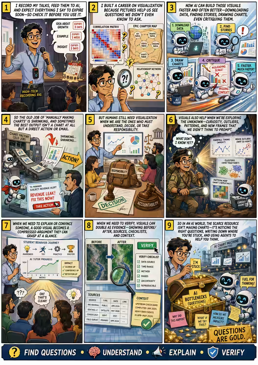
A visual summary of the session — the argument against the course, the pushback from the room, and the five uses that survived.
A man who spent two decades building a data visualization company walked into a data visualization course and spent the first half hour arguing that the students shouldn't need to be there. Then the room fought back — and between them they found the part that doesn't go away.
Recorded on a phone hanging from an office lanyard
Read the full transcript ·
Download audio ·
ED5518 course outline (PDF)
In a hurry? The one-page comic is the whole hour in a handful of panels.
The recording setup was, as Anand described it, "a very high-tech way of recording my talks." It was his phone, hanging from the lanyard of his office badge, with the badge taken off.
He feeds the recordings to his models afterwards and asks them two questions. First: what mistakes did I make? Second — and this is the more unusual one — what did I say yesterday that is no longer true, so I have to go correct myself?
Which set up the disclaimer he opened with, and which is worth putting at the top of any page that transcribes him:
"Whatever I say now will expire very soon. It has a short shelf life — some things may last for a few years, many things will last only for a few months."
Anand, roughly 40 seconds in
And then the escape hatch, delivered deadpan: "Make sure whatever you think you are learning, you check before using; and if you don't learn it, don't worry, you don't have anything to forget. Harmless."
ED5518 is a serious course. Nine credits, a prerequisite list that runs from linear algebra through Pareto fronts, and a syllabus that walks from how technology shapes charts through perception, uncertainty, verification, critique and accountability, ending in a twelfth-week "capstone decision room" where students defend a live decision interface in front of engineers, users and skeptics.
Anand did not pick a topic from it. He took a slice across three of them — purpose and problem framing, verification, and a third that isn't quite on the syllabus but turns out to hold the other two together: communication. All aimed at a single question.
"All of these are focused on one theme, which is: why on earth are you even sitting in this class and learning it if AI can do all of it tomorrow?"
Anand, opening the argument
Before he could argue the job away, he had to establish that he had held it. "For many decades, my life was data visualization. I got my internship because of one data visualization. I created a company that does data visualization. I've even sold the company."
The internship was at Lehman Brothers, and the chart that won it was a correlation matrix of securities: currencies, commodities, indices, all cross-correlated and then reordered so similar things sat together. Gold, silver, platinum clustered — unsurprising, they're precious metals. But sitting right there with them, negatively correlated with almost everything else, was the Pakistani Rupee.
Anand still doesn't know why. That was the point.
"They said, 'Look, this is a very different way of looking at things — not something that we had explored before, not something that we had seen before. Very good.'"
Lehman Brothers, hiring an intern on the strength of one chart
Then he founded Gramener, later sold to Straive. And the visualization that "caught on like wildfire" was not a business chart at all.
Take the epic. Make each chapter a bar, its length the word count. Now mark where each character is mentioned. Yudhishthira is everywhere, right through the book. Arjuna is not — which is how Anand discovered that large stretches of the Mahabharata have nothing to do with the war or the brothers at all, and are just philosophical discussion.
Then came the gossip test. There is a persistent story about Karna and Draupadi. So he looked.
"Draupadi, Draupadi, Draupadi… Ha. Having an affair. Now, is that true? I scanned through the whole thing and found that there are very few chapters where they're even mentioned together. So at least according to the original epic, this can't be. Now, this is a very efficient way. I don't have to sit and read the entire story to find out the answers to important questions like these."
Anand, on the noblest possible use of data visualization
Which opened the real door. If two characters appear in the same chapters, they're connected. Nala and Damayanti light up in identical spots. Subhadra doesn't. So you can build a similarity matrix over characters and lay out the whole cast as a network — and read the social structure of the epic without having read the epic.
Gandhari, it turns out, talks to exactly three people: her husband Dhritarashtra, her brother-in-law Vidura, and her sister-in-law Kunti. That's it. That's her whole world.
And then the chart said something that was, quite clearly, wrong. Anand asked it who Draupadi's favourite Pandava was. Sahadeva sat close. Nakula, close. Bhima, close. Yudhishthira, not far. Arjuna was the furthest away.
"I said, 'Wait, hold on. I thought Arjuna was supposed to be her favorite Pandava. This is telling me that something is wrong.' I redid the calculation. Redid the calculation again. Yet again. Every way I tried it, Arjuna was the furthest away from Draupadi."
Anand, debugging an epic
The bug was not in the code. It was in the assumption. An investment banker in Pune eventually explained it: there is a play — "this Bengali play which in turn is based on a Marathi play, or the other way around" — built entirely on the premise that Draupadi loves Arjuna and there is no matching evidence of Arjuna loving Draupadi.
Anand's diagnosis is the sharpest methodological line in the hour, and it applies far beyond epics:
"If you are trying to plot a symmetric relationship, you should realize the entire play was about how Draupadi felt ignored because Arjuna went around gallivanting with lots of other people."
Anand — the chart wasn't wrong, the symmetry assumption was
Which is how a chart about a 4th-century BCE epic taught him about 20th-century regional theatre: "Not only am I learning about the Mahabharata, I'm learning about derivatives of Mahabharata and inner politics and so on." People saw it, said "data visualization can show you so many things," and bought Gramener's services. It worked.
Click any character. The layout is built from co-occurrence across chapters — nobody encoded the relationships by hand.
↗ The Mahabharata · character closeness ·
↗ The securities correlation matrix that got him hired
And then the turn the whole hour hangs on:
"But here is the thing: today, AI can create these visualizations faster than I can. The bulk of what I used to do for about two decades was painstakingly create these visuals, write the code for it, iterate manually. Now AI does it significantly faster."
Anand, dismantling his own career in one sentence
So he asked for a show of hands. Who thinks we still need to learn data visualization? Most of the room. Who thinks we don't?
Four hands. Anand counted them approvingly — "four brave hands" — and then refused to grade them:
"I have no idea who's right, who's wrong. This is one of those things where I have zero clue. But who knows, maybe the four of you are right."
Anand, on the only honest answer available in 2026
He also set the ground rules for the hour, which he attributed to Kareena Kapoor in Jab We Met: "please stop me at any point. But otherwise, I will just keep talking." The room laughed. The room did, eventually, stop him — and that's where the talk gets good.
Part one · the case against the course
The Times of India came to Anand with a property they were about to kill. It was called Stat-TOI-stix — statistics, with "TOI" wedged into the middle — a recurring set of data cards in the paper. The reason for shutting it down was straightforward: making the visualizations took too much effort.
"I said, 'Okay, fine, let me do one thing. I will give you five interns. You do them.' Those five interns were agents. What do I mean by agents? ChatGPT."
Anand, staffing a newsroom
The pipeline had three prompts and essentially no human labour. Step one was the data engineering, historically the expensive part:
"Download all data from UNdata — data.un.org — efficiently. If there's an API, you find out how to use it, write the Python script, blah, blah, blah. Make sure that the script is resumable."
The entirety of prompt #1, given to Codex
His effort: about five minutes of looking at it, plus a minute or two checking it was still running. The agent's effort: half an hour writing the program, half an hour running it. "The data engineering problem, which used to be a big part of data visualization, seemed to vanish."
Step two was the insight hunt, with an unusually well-specified brief — find the obscure and the surprising, because the obvious has been mined already, and make it true, verifiable and simple enough for a lay audience. Five minutes of his time, a couple of hours of the agent's. He took the results to the paper's editors.
"This is better than anything our journalists produce."
Editors at the Times of India, on 100% AI-generated story leads
Step three was house style. He told an agent to go to the Times of India, download all the published PDFs, look at what the cards look like, and write itself an instruction file called "Stat-TOI-stix format." Then render everything as consistent SVGs in that format.
Did he have to fix anything? Some text spilled over. And then the newspaper politely asked him to stop helping:
"Anand, you don't bother doing all this. Leave some work for us. We have a graphics team. That is what our graphics team does anyway, and we are very efficient at it. We will take care of all of these things; you just give it raw."
The Times of India graphics desk, defending its territory
"Okay, fine," said Anand. "Why take your job?"
The gallery of AI-generated data cards. Each one carries a Verify button — see below for why that mattered more than the chart.
↗ Statoistics · data cards gallery ·
↗ How AI builds a data newsroom (the full process) ·
↗ "Common Birthdays in India and US", as published (PDF)
Speed was never the sticking point. Trust was. The editors' objection is the best articulation of the AI verification problem anyone gave that hour, and it came from journalists, not engineers:
"We want to check if it is correct. How do we know that it is not making a mistake? Our journalists also make mistakes, but the journalist I can ask them, 'How did you do this?', sit with them, blah, blah, blah. You have given me something, I don't know how to do that."
The Times of India, on the real problem with a machine colleague
So Anand added a fourth instruction: add citations, think about how they will verify it, and produce a comprehensive verification checklist and statement of procedure. Every card got a Verify button that opens a step-by-step audit trail — what the card claims, which fields and tables it came from, the source table's row and column counts, every number in the card traced back to its source value, the ways you should check it, and the ways you might get it wrong. Then a tick-box checklist: confirm the record count was actually 41,659, tick. Confirm the next one, tick. All ticked, card verified.
They followed the procedure religiously for the first card. And the second. And, roughly, up to the tenth.
"Yeah, okay, this is not making a mistake. Maybe we will check every third or fourth; we will run a sampling of sorts."
The Times of India, arriving at statistical process control by exhaustion
That drift — from full audit to spot check — is the whole story of institutional trust, compressed into ten cards. Anand's summary of what the pipeline actually did:
"Effectively, what we were doing was compressing the cycle of identification, generation, and verification. What is the insight? How should it be presented? And how to verify?"
Anand
And the punchline, which is the one that should worry a room of students: he doesn't even write the prompts any more. "I've written those prompts. Now I don't even have to do anything. I just have to say, 'Do it again.'" That's how the rest of the cards got made. Why do I have a job?
This is the section where Anand quietly drops the most extraordinary fact about himself, in the middle of a sentence about clustering:
"My life's greatest achievement till date is that I sat and spent six and a half years typing out every single Calvin and Hobbes strip."
Anand, on a résumé line that does not appear on his résumé
The result lives on a website he refuses to publish, because he already got a DMCA takedown notice for it. But it means he can search two decades of comics by text — "what is that little Tracer Bullet comic where…"
What he could never do was visualize it. He knew what he wanted — some comics are similar, group them, show me the clusters — and had no idea how. 3,000 strips. He failed at the attempt and left it.
Then he handed the same problem to Codex.
What came back was a UMAP of every strip, each dot a comic, arranged by similarity — and the clusters are immediately, delightfully legible to anyone who's read the strip. There's a distinct island for Moe the bully, different from everything else in both art style and language. Another for the entire imaginary-alter-ego canon — Spaceman Spiff, Tracer Bullet, Stupendous Man, the dinosaurs. Another for Rosalyn the babysitter. And a timeline slider that plays the clusters forward, so you can watch Moe vanish from the strip for a stretch and come back.
"A, it is able to create a similarity matrix. B, it is able to create a visualization in a way that I would not have thought of."
Anand
Is it using similarity based on the text and description in the strips or is it something else?
It is based on the text and image embedding using the Gemini API.
Which triggered the clearest ninety-second explanation of embeddings you'll hear. "Embeddings are where you convert text into numbers." The naive version: take all 40,000 words in English, put them in a spreadsheet, and for each comic tick the words it contains. You now have a 40,000-digit binary number per comic.
The problem, in Anand's example: "cold" and "cool" are different words; there's nothing similar between them. So instead of words, use concepts. Does this text have coolness? Maybe 70% — write 0.7. Anger? 5% — write 0.05. Do that a few thousand times and the distance between two lists tells you how similar the two things are. And the numbers come in order of diminishing importance, so you can cut the list short and keep most of the meaning. Feed it images as well as text, and the same distance works across both.
Then the honest accounting of what he contributed, which is: the requirement, and nothing else.
"This, therefore, firstly is not something I would have thought of because I didn't know about embedding similarity. I would not have thought of because I didn't know about UMAPs. Also, something that I would not have thought of because I wouldn't have even known that this sort of a thing can lead to temporal patterns."
Anand, on being out-imagined by a coding agent
The same trick generalises alarmingly well. Point it at the images of published data journalism and you get a map of the visual identity of newsrooms. The South China Morning Post forms a tight, unmistakable island. So does Reuters — somewhere else entirely. The Guardian and the Financial Times are scattered all over, because they change style to suit the story.
"If I had to say, 'Give me two completely different styles of data visualization across all the papers,' then these two, I would say, are very contrasting things. This is not a question that I even knew I could ask, but it is able to solve it for me without my even asking for it."
Anand
Point it at OpenAlex — the open index of the world's research papers — and you get a map of science itself, with one institution's output highlighted inside it. The axes weren't specified by anyone; the model constructed them and they turned out to be readable:
Left is AI, vision and perception. Right is materials, energy and devices.
Top is living systems and biology. Bottom is equations and formal systems.
From 2021, maths moved away from biology — the COVID research wave receding — and away from AI and vision, towards materials, energy and devices.
Which converts into advice an institution can act on: if your papers sit where the field was three years ago, you are about to be left behind. "Again, something that it was able to do better than I could, because this is 100% AI-generated."
The prompt was close to a dare. "Create a bunch of visualizations that I have never created, nobody has ever created, genuine innovation, and show me what you can find."
What came back — and what Anand is visibly fond of — is a causal lag clock matrix. It is, pointedly, a descendant of the correlation matrix that got him hired at Lehman, except it answers a question that one couldn't. Eight financial variables, cross-correlated: blue for positive, red for negative, as usual. But each cell also contains a little clock hand. The direction the hand points tells you which variable leads and which lags; how far it's rotated tells you by how many months.
"Yield spread is a strongly leading indicator of retail sales by about seven months, which means that if you want to predict retail sales seven months later, look at yield spread today. The correlation is as much as 58% — not a bad correlation. That is useful."
Anand, reading a chart form that did not exist last year
Scan for clocks tilted right and you've found your leading indicators. Find that something you currently forecast with is a lagging indicator, and you stop using it. His verdict has two clauses, and the second one is the hard one:
"This is a novel visualization in that A, it does not exist, and B, it is useful in that, well, I actually do plan to use this wherever I can."
Anand, on the difference between novelty and invention
Three chart forms generated from a single prompt asking for something nobody had made before. The causal lag clock is one of them.
↗ Three Novel Data Visualizations ·
↗ The Calvin & Hobbes UMAP ·
↗ The visual identity of data journalism
Anand allowed himself one line of retreat. Fine — the machine can generate. But he was standing in a classroom. "At least as a teacher, if I'm correcting your papers, I need to learn how to critique your visualization. Or at least for that, I have to know data visualization, maybe?"
Then he tested that too. A colleague, Jaydev, had sent a chart round on WhatsApp asking for critiques. Anand forwarded it to Claude — "a friend is asking me for some critique on this. Give me the critique and, by the way, give it to me as HTML" — and got back a list that beat him on every axis.
The top and bottom charts can't be visually connected.
Starts at 0.06, not zero. Anand had to peer closely to spot it.
"Very true, makes it so much easier to understand."
Free electricity, midday meals, LPG subsidy — joined by a line chart. Is there an order to these?
Anand's pick for best point in the list: what does this colour mean, and why red if it isn't a bad thing?
Plus the classic: correlation versus causation. His scorecard on the machine's critique was three letters long, and each letter costs a teacher something:
"A series of points: A, more than I could point out; B, better than I could point out; C, certainly faster than I could point out."
Anand, grading the grader
The critique itself, rendered as HTML because that's what the prompt asked for.
↗ Chart Critique ·
↗ The full Claude conversation
Up to here, the argument was only that AI does data visualization better than you. Now Anand goes after the artefact itself.
"Boss, why do you need data visualization?"
Anand, going after his own life's work
The evidence is a colleague named Thanoj, at a logistics company running Snowflake Cortex — "like the ChatGPT sitting inside Snowflake" — over all the company's data. He asked it for use cases. It produced fifteen.
He took them to the head of analytics, who compared them against a report on his desk. That report was the output of a three-month engagement with a strategy consulting firm, November to February, described as "very expensive."
"There is an 80% overlap."
The head of analytics, comparing a very expensive quarter to an afternoon
Thanoj, understandably thrilled, set about building a visualization for each of the fifteen. Revenue forecasting: a chart. Pricing anomaly detection: an outlier chart. And so on. At which point Anand asked the question that unravels the entire deliverable:
Yaar, what is the guy going to do with that pricing anomaly detection?
Well, he will correct — he will find out where the anomaly is and then correct it.
You do it for him, no?
So instead of an outlier chart, Thanoj sent an email. Here is the whole analysis, in the form it was actually delivered:
"I ran an anomaly detection check and for our services which cost $175 to $179 every month, there were 105,000 transactions which are less than 16 cents. Either you have a massive data quality problem, or you are charging 16 cents instead of $160 or $170. In which case you have a massive revenue leakage. Either way, you have a massive problem."
The email that replaced the chart
There was no visualization attached. There didn't need to be. (The full generated use-case brief for the sector is worth a look — the deliverable is prose and numbers, not charts.) Anand's verdict on the whole exercise is the line that should be printed on the door of every dashboard project:
"One of the emails was, 'We are losing $170 million in revenue. Here is the fix.' That one subject is more important than any visualization that you can show. $170 million."
Anand
And the email didn't stop at the number. It named the customers — go talk to the US Department of Energy, Meridian Chemical, Summit Refining — if you want to keep them, because otherwise they're leaving.
The logic underneath is short and hard to escape. What do we want people to do with a data visualization? Decide something, and act on it. So: decide for them and tell them what to do. Better yet, act for them — connect the agent to the source systems and let it fix the problem.
Which is, almost word for word, week eight of the course the students are enrolled in. Anand had just argued the case for delivery number three.
"Why do we need this course? Any guesses? Or any thoughts, any counter-thoughts? So here I'm basically saying, look, you don't need to learn data visualization because AI knows data visualization. Secondly, you don't need the course at all because we don't need data visualization. Thoughts?"
Anand, having spent half his hour arguing himself out of a job and the students out of a class
Four answers, in the order they came
"Every time we are going through something, we are visualizing… now what matters is how fast are you going to convey a large amount of information in a short span of time?"
Seven words. Anand called it "an excellent point" and rebuilt the second half of his talk around it.
"To get some insights out of it. To just get to know what exists."
"We take decision and check whether it correlates with things." Anand: "As a cross-check, got you."
Anand pushed back on every one of them — "Visualization efficiently conveys understanding. Why do you need to understand? Agent is understanding. Why are you standing in the way slowing things down?" — but two of these answers survived the pressure, and they turned out to be the two the rest of the hour was built on.
The seven-word answer — "it's always being driven by human beings" — got the most interesting riff of the hour. Anand's expansion is that responsibility is a solved legal technology, and agents are conspicuously outside it.
"Ultimately, we don't yet have a mechanism to hold an agent responsible. Humans are responsible. Companies are responsible. We know how to take companies to court."
Anand
And then a genuinely surprising list of things that our legal systems have already figured out how to hold responsible:
Sued, fined, dissolved. The template for everything below.
A vessel can be taken to court and stripped of its assets in its own name.
They hold their own funds and are administered on their own behalf.
"We have not yet cracked how to give agents money, how to take an agent to court, how to kill an agent, or in the case of a company, we dissolve the company, we shut down an agent, whatever. We will figure it out. So until then, humans are responsible."
Anand, on the load-bearing gap
The consequence is not sentimental, it's structural. For as long as a human signs off — "maybe for a few years, maybe even for a few decades" — that human has to actually understand the thing they're signing. And visualization is how you compress enough of it into a head fast enough to be accountable for it.
Which drags verification along behind it: "if accountability is important, meaning you're hanging your neck out for it, your need to verify stuff becomes important. Is the visualization actually showing you what you really ought to see?"
The fourth student said visualization is a cross-check on decisions. Anand pressed — if the agent decides as well as you do, and these days better, then what? — and then answered his own question with the sentence that reframes everything before it.
"Where you're stuck may actually be the point, which is, 'Look, I am not sure I know, but maybe there is something.' Put another way: I don't even know the question to ask. So how do I know that it is giving the answer when I don't know the question?"
Anand, arriving at the thing that survives
A question you can articulate is a question an agent can answer. The residual value of a chart is that it shows you things you weren't looking for. "I want a different perspective of looking at what I don't know."
Click to open full size in a new tab
A visual summary of the session — the argument against the course, the pushback from the room, and the five uses that survived.
Part two · what he still uses it for
Anand's own defence of visualization starts from a category of things that cannot be delegated on principle:
"There are some things that I do for myself. I eat. I sleep. The agent can't sleep on my behalf, can't eat on my behalf. The agent also can't watch movies on my behalf — well, that's coming later."
Anand
And: "the agent can't solve my curiosity." The worked example is gloriously trivial, which is the point. A friend blogged about Bangalore weather, and Anand started wondering: is there a specific window of the day when it rains, such that if I carry an umbrella only then, I'm covered?
The chart he ended up with is not a standard chart, and he says he "wasn't even thinking twice about it." Each city, January to December, coloured by how cleanly an umbrella window separates rain from no-rain. Caracas has the tightest window on Earth — in August, a 57% chance of rain inside the window and 5.7% outside it.
"This part is the information compression. I can instantly understand and I can instantly verify, and that is useful. … I knew my problem clearly. My problem was: I want to figure out in an instant where it only rains inside that umbrella period, and I will know it when I see it."
Anand — "I will know it when I see it" is a legitimate spec
Then he browsed for the worst cities, live, with running commentary. Cairo: hopeless, no umbrella period at all. Ahmedabad is among the worst in India — you simply cannot time it. Pune is decent in June through September. Kolkata, okay. Chennai, not good: in the rainy season you carry it all day. Somewhere in the middle of scrolling he interrupted himself with "why am I doing this?" — and then noted that this exact frustration is why he later added a search box.
The IMDb explorer dates to 2008, sketched on a whiteboard with Col Needham, IMDb's founder, while the two of them argued about how they pick what to watch. Votes on a log X-axis, rating on the Y. Top right: the beloved and the widely seen.
Anand turned it into a guessing game with the room. What's the top-right movie of the 2020s?
Spider-Man
Student — half rightDune
StudentOppenheimer
Student — correctThe answers were Spider-Man: No Way Home and Oppenheimer. "Yeah, spot on, you know the movies to watch." Anand's own confession: "I have not seen Oppenheimer fully yet, only halfway there."
Then the far more entertaining direction — the bottom right. Very popular. Terrible rating. "Almost an embarrassment."
Indian movie?
Snow White?
Any other guesses? Snow White is in fact correct. [Laughter]
"Now, this is not just a disaster of the 2020s, this is the disaster of all years. Like, there has never been this popular and terrible movie ever."
Anand, on Disney's 2025 live-action Snow White
But the reason this chart earns its place isn't the outliers. It's what happens when you filter to animation and scrub through decades — you get the history of an art form, told by nobody:
Snow White and the Seven Dwarfs. That is the entire decade. That is where the genre starts.
Four Disney films and four non-Disney in the forties — and a visible quality gap. "Disney was the only show in town."
Fewer Disney titles, lower ratings across the board.
My Neighbor Totoro — Miyazaki and Studio Ghibli pushing the ratings up from outside Hollywood.
The Lion King, Disney's "last great original," and Toy Story, Pixar's first blockbuster. Then the sheer volume explodes with computer graphics.
"Effectively, I get to see the history of a field, a question that I didn't even have. I didn't even know that I had this question or that this is a thing, and I'm able to explore it."
Anand
Filtered to animated films, as Anand had it on screen. Scrub the decades and watch Disney's monopoly, decline and Pixar-era rebirth.
↗ IMDb movie explorer ·
↗ Where does it rain on schedule?
Here Anand made a distinction most visualization courses skip. There are two mechanisms by which AI makes an image, and they have completely different properties:
HTML, JavaScript, SVG. It draws using its knowledge of code. The result is interactive and editable — but bounded by what can be programmed.
It draws using every image it was trained on. Harder to edit precisely, but "anything that can be represented as pixels, it can draw."
Which raises a problem Anand admits to plainly: "I don't even know what I can create." Creativity used to be his contribution; now the constraint is his imagination of the format, not his ability to execute it. So he had Claude enumerate the space — a catalogue of comic rendering styles. Elegant brush. Spot-black economy. Flat icon. Ratty line. Peanuts, Tintin, Archie, Amar Chitra Katha. Now it's a copy-paste menu.
"When it comes to exploration, it is not just exploration of the content that we are asked to do as data visualizers. We are also asked to explore formats."
Anand
And then the three questions that got the widest eyes in the room:
"Why should a data visualization not be an engraving on the factory machine out there? Literally an engraving."
The machine drops a bead as it produces. Five little stacks grow over time, one per error type. Physical data visualization, no screen involved.
"Why should it not be data sonification?" Operators already listen to machines and know how they're running. "That is a feature, not a byproduct. You can design for it."
The style catalogue. Find a look you couldn't have named, copy its prompt.
↗ LLM Art Style ·
↗ AI image scores, ranked — the same idea applied to student work
In his Tools in Data Science course, Anand has keystroke-level data: every character every student typed, which second they solved which question. He gave the lot to an agent, which came back with a competent, useless answer — "there are four types of solvers, this is the performance…"
"Boss, I don't get it. Explain it to me in a way that I can explain it to someone who doesn't get it."
Anand — arguably the single most reusable prompt in the hour
What came back was a chart of each student's path through a 120-minute exam, and it made the four behaviours instantly nameable:
One question after another, in order. Sometimes they fail and move on, sometimes they come back. An almost straight line.
Try, fail, return. Try, fail, return. Round and round the same question.
Skip questions entirely. Never even attempt the ones in the middle.
Stuck on bad questions. 40 minutes on Q1 — got it. 40 minutes on Q2 — got it wrong. Moving slowly, getting stuck.
And then the finding, which is worth pinning above any exam desk:
"We know that the students who are going question after question after question — not necessarily solving them, but scanning them linearly — are performing the best."
Anand, with the honest caveat: "Now, is this correlation or causation? We don't know."
Which converts into one piece of advice a TA can give in one breath: skim every question at least before writing the code. Don't skip, don't toggle, get a sense of perspective.
But — and this is the part that makes it a visualization story rather than an analytics story — the advice would not have landed without the picture.
"If you want to convince somebody of your argument, you need to show a visual proof, and the quality of that visual — the extent to which what you show matches what you want them to do — determines whether you succeed or not."
Anand
See the solver-path chart in its original slide, from Anand's PyConf Hyderabad 2026 talk on how students learn Python.
Anand's hardest sales job is convincing people how fast AI is improving. His instrument is a scatter plot of every frontier model. X-axis: cost per million tokens — roughly what it costs a model to read all of Harry Potter. Y-axis: intelligence, scaled to human education levels via Elo score.
Read it left to right and the story tells itself.
"So in about two, two-and-a-half years, from a high school student to a tenured professor. That is how fast it is becoming smarter." — and the reaction he's after: "Ah, okay, AI is getting smarter at a pace that is faster than I had imagined." · Explore the live chart
Then comes objection number two, which he says is universal: "Ha, but AI applies in that field, not in my field."
For that he uses GDPval — OpenAI's benchmark of real professional deliverables, graded blind against experts' own work. Green means the agent did better. Red means the human did. And the tiles have been turning green.
Accountants and auditors were beating the models last year. This year, not so. Which is where the talk produced its most expensive anecdote:
"My auditor submitted a return on my behalf; I had ChatGPT cross-check it."
Anand
The model spotted that capital gains from an HDFC holding had been filed under Indian taxation without applying the double-taxation treaty — Anand lives in Singapore. He put the question to his auditor. She said it was because it was an NRO account. He replied — armed with a judgment he had not read until that week — that the judgment says nothing about NRO accounts. She went to consult her senior.
"Next day she came back and said, 'Okay, you saved 14 lakhs.' Fourteen lakhs! Are you crazy? And I know nothing about tax. I was simply asking ChatGPT, 'Is she correct? Is she correct? Is she correct?'"
Anand, ₹1.4 million richer for asking the same question three times
He's careful about the claim, though — "maybe not an expert, I don't know — but certainly beat my auditor." And the reason he shows the task-level drill-down rather than the headline is a lesson in persuasion:
"If I just said, 'Oh, it is smarter,' they'd say, 'Yeah, but on what?' Maybe not trying to move them from a 'no' to a 'yes'; if I move them from a 'no' to a 'maybe', that is a huge deal. … And a list did not have that kind of an impact."
Anand, on the actual job of a persuasive chart
Green: agents beat the human experts. Red: humans still win. Drill into a cell to see the actual task an expert wrote.
↗ AI Impact on Sectors & Occupations ·
↗ The GDPval study itself
Embeddings, Anand pointed out, aren't only for text and images. They work on satellite imagery too. Take a patch of Earth on one date, embed it; take the same patch on another date, embed it; the distance between them is how much that place changed. Run it over a grid and you have a change-detection map of a whole city — the approach behind OlmoEarth, Ai2's open Earth-observation model family.
His colleague Varun built exactly that. And the first version was, by Anand's own account, unverifiable.
"When we originally created this version, I had no basis for verification. One of the first things to do, therefore, was to add a map behind so that I can see what this place is."
Anand — the fix was context, not accuracy
With satellite imagery behind the grid, the cells became claims you could check by eye. Live, on Chennai:
January 2015 versus December 2025, comparable seasons. "There actually is a lot less water in the Adyar River in 2015… and yes, this is a known thing" — the river holds more water this decade than last.
New buildings, and a visible loss of greenery on the left. "It was able to spot the difference beyond just the fading of the images."
A ground converted to — or grown into — green land. "Converted, or has become green land, I don't know, but there is definitely more green cover here."
Reds mean vegetation lost, greens mean gained. Zoomed out, the verdict on Chennai is blunt: "overall in Chennai, things have generally worsened from a vegetation perspective."
Then the Times of India asked for one more thing — a before picture, an after picture, and an agentic web search explaining what actually happened there. Which produced results like: this patch of North Bangalore moved from cramped legacy facilities to 40 acres of rural scrubland transformed into the new BCCI Centre of Excellence.
"Now you get context. Now I am able to believe it. This is a way of verification."
Anand
And here he draws the distinction the course spends a whole week on. There are two directions of verification, and he'd now demonstrated both:
The Times of India checklist. A stated procedure, source tables, row counts, every number traced. "Anyone who processes it will know that it is true."
"This is the complement." Before picture, after picture. "You say, 'Yeah, I agree, this has in fact changed. I can see the nature of the change and yes, this is valid.'"
Explore it yourself: the OlmoEarth output library · Chennai, water delta over 10 years · Gurgaon, vegetation delta over 5 years
Anand's own closing summary, in his order
"What on earth don't I know in the first place?" The framing job got harder, not easier: "what is it that I don't even know I don't know? And what kinds of visualizations can expose that?"
For yourself, or to convince someone else. "And by design, I don't mean the aesthetics, I mean the form, the function." The test: one look, and "Ha, I get it. You are right."
Whether for yourself or a reader — and "use AI agents to critique your own visualizations, they're pretty good at it."
All three share one property, and Anand names it explicitly: "Data visualization in all of the cases that I was using it for, you'll find, was primarily for human consumption." Where humans have to be in the room — because we're the endpoint, the actor, or the one who is accountable. "And if that is the case, then the purpose to which we apply data visualizations to needs to align with that."
The practical instruction Anand left the room with is the smallest and, he'd argue, the highest-leverage thing in the hour. It starts from a premise about what is now scarce:
"If agents make the cost and time of solving problems down to zero, the difficulty is finding questions. If you are stuck, fantastic, you have a problem to solve. Stop wasting that valuable resource."
Anand
He keeps a file called AI Bottlenecks. Every time something frustrates him, it goes in, dated. And then — this is the part that makes it work — he goes back and annotates entries when he later solves them, or delegates them, or turns them into a reusable asset.
He put his actual list on screen. It is charmingly unimpressive, and he knows it: "You'd say, 'Boss, there are better things to get stuck on,' but this is what I was stuck on that day."
Anand's actual file · most recent first
talk-prep.md to park the learnings into./loop are (a) imagining higher order problems and (b) defining a measure of success / progress.The tags are the method. #Learning means he changed how he works. #Delegate means an agent took it. #Assetize means it became a reusable file — a skill, a prompt, an AGENTS.md. "At any point, I have a list of known problems, not vague unknown problems. Document yours."
The "too many chats" entry, incidentally, escalated. Anand built an entire application whose only purpose is to track his browser tabs. As of that afternoon, he had 162 tabs open, spread across multiple windows.
His resolution to it is a discipline, not a tool: whatever a tab says, hand it to an agent and say "you do what I'm supposed to do." Or close it. "If I don't understand it, why do I have it open?"
A student pushed back on the close-the-tab advice with an honest confession: what if the model says something isn't important, but I think it might be? I can't just let it go.
Anand did not argue. He confessed harder:
"My to-do list is 25 years old. Meaning I have items from 2001, and maybe slightly before, that I'm still storing. I won't throw it away. I completely relate to it."
Anand, on not fixing yourself
The resolution isn't discipline, it's infrastructure. "So don't — just archive it." He has a separate program that scans every open tab daily and saves the list, so nothing is ever actually lost. "The reason I'm comfortable saying 'close tabs' is because I have it archived." Closing is only cheap if retrieval is free.
The last real question of the hour, and the best one. Anand's answer has three layers.
Layer one: don't ask a probabilistic system to do a deterministic job. He doesn't have an agent closing his tabs. He has an application — written by an agent — that closes his tabs.
"The agent, therefore, does not have to do something that may be non-deterministic when it can be delegated deterministically to a program. So I tell it, 'Solve the problem, see if you can do it through a program. If you're doing it through a program, save the program and reuse it next time.'"
Anand
Layer two: for what's left, benchmark it. Two days before the class, Anand had run exactly this on transcript summarization — the same pipeline that produced the transcript of this talk. He described it live and slightly breathlessly while hunting for the file. Here is what the run actually found:
| Field | Gemini 3.5 Flash | GPT-5.6 Luna |
|---|---|---|
| Summary | 2.88 | 3.19 |
| Keywords | 3.12 | 2.69 |
| Actions | 2.75 | 2.38 |
| What I missed | 2.12 | 2.81 |
| Ideas | 2.00 | 2.00 |
| Overall (0–4 scale) | 2.575 | 2.612 |
| Relative cost | 2.47× | 1.00× |
Quality was a statistical dead heat — a gap of 0.037, well inside judge noise. The decision was made on the cost column. Anand's summary in the room: "on the summary, Luna was actually better, keywords Gemini is better… Luna is about half or 2.5 times less cost, so it said, 'Move to this.'" The scoring was done by one model and verified by another; he skipped the most expensive judge on principle — "I would have tried Fable, but I said, let's not waste too much money."
The test corpus, he mentioned in passing, included his daughter's conversation with a dermatologist — which tells you something about how ordinary this kind of evaluation has become.
"Is this perfect? No. Is this better than the other model? Yes, almost clearly and convincingly. Is this better than me doing it by myself? Absolutely. I'm far more expensive and for this volume, I will make more mistakes."
Anand, on the correct baseline for judging AI error rates
Layer three — and this is where the hour lands. Anand had put the question to a model directly, in the plainest possible form:
"How am I going to verify you when you are smarter than me in taxation?"
Anand's prompt
The reply reframed the whole problem as an old one:
"Anand, this is a problem that has been there for centuries. How are you going to verify your auditor who's smarter than you at taxation? How do judges pass judgments on a patent when they don't understand engineering? How do regulators who don't understand telecom pass a telecom bill? We've been solving this problem for centuries."
The model, to Anand
And then it handed over the toolkit, which is not technical at all:
"How does the FDA verify drugs? They have a checklist of a process." Follow it and the drug is deemed at least not too much of a disaster. You don't verify the chemistry — you verify the procedure.
"How do we make sure that the real estate agent is not going to cheat me? Because he's going to get paid only after I get the house." Commission, contingency, skin in the game.
"How can I learn from the wisdom of all these other professions in the past where people have verified people smarter than themselves, and I'm applying those techniques?"
Which is a satisfying place for the hour to end: the newest problem in the room turns out to be one that auditors, judges, regulators and drug agencies have all been quietly solving since before anyone wrote a line of code.
Anand closed with an offer and a search-engine flex. "Just search for my name, S. Anand — Google me, you'll probably find me as the first or second hit" — his contact details are on his blog — "just welcome to drop an email anytime."
And then, characteristically: "The class is technically over, however you are free to hang out."
From an hour spent arguing that the hour was unnecessary